
Apple
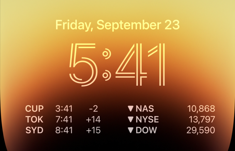
Enlarge / The (customized) lock
screen in iOS 16. (credit: Samuel Axon)
For the past couple of years, Apple’s annual iOS updates have laser focused on one feature for an
overhaul while making smaller tweaks to everything else. Last year, Focus was the, well, focus. The year
before that, it was the home screen.
This time it’s the lock screen. You can now change fonts, add widgets, customize the information
displayed, and pick from a wider variety of wallpaper. Apple has also more deeply integrated the lock
screen with the Focus modes that were fleshed
out in iOS 15. And it has laid the groundwork for something more than just notifications that
third-party apps can show you before you unlock your phone.
Given the increasingly iterative nature of iOS releases today—with many key features not arriving until
months after the initial ship date of a new, whole-numbered version—we’re moving to leaner initial iOS
reviews, with updates to come in additional articles over time. So today we’re going to look at the main
new feature of iOS 16, but we’ll touch on a couple of other key features and changes, too.
Table of Contents
- The lock screen
- It starts with wallpapers
- Customizing the lock screen
- The widgets are a start, at least
- Notifications have been redesigned
- Focus
- Focus filters
- Beyond the lock screen
- Mail and Messages
- Maps and transit
- Safari and passkeys
- A few other notables
- It’s the little things, really
- The good
- The bad
- The ugly
The lock screen
While iOS 16 touches most aspects of using the iPhone in a variety of small ways, it is very much “the
lock screen update.” That makes sense: Apple makes a lot of noise about shipping features that integrate
hardware and software, and the iPhone
14 Pro’s new always-on display drives this emphasis on the lock screen.
But there’s plenty here for users of other iPhone models that lack that always-on feature. Following up
last year’s emphasis on Focus modes, and the previous year’s on home
screen customization, this is the most significant move Apple has made on the customization
front with the iPhone in, well, pretty much ever.
I know what you’re going to say: aren’t these all features that have been part of Android for basically
an eternity now?
Yep, you’re right—mostly. In typical Apple fashion, there are some flourishes here that Android doesn’t
touch, but as for functionality, this is mostly yesterday’s news for Android diehards. But what was
already a win for Android users is largely a win for iOS users, too.
It’s easy to see the influence of the Apple Watch on this update—the new widgets behave like
complications, and the new lock screen acts like a Watch face. That sentence right there tells you just
about everything you need to know about the new lock screen. Picture the Apple Watch and all the
customizations, features, and limitations the Watch faces offer. Now make all that phone-sized. There
you go, that’s the new iOS lock screen.
-
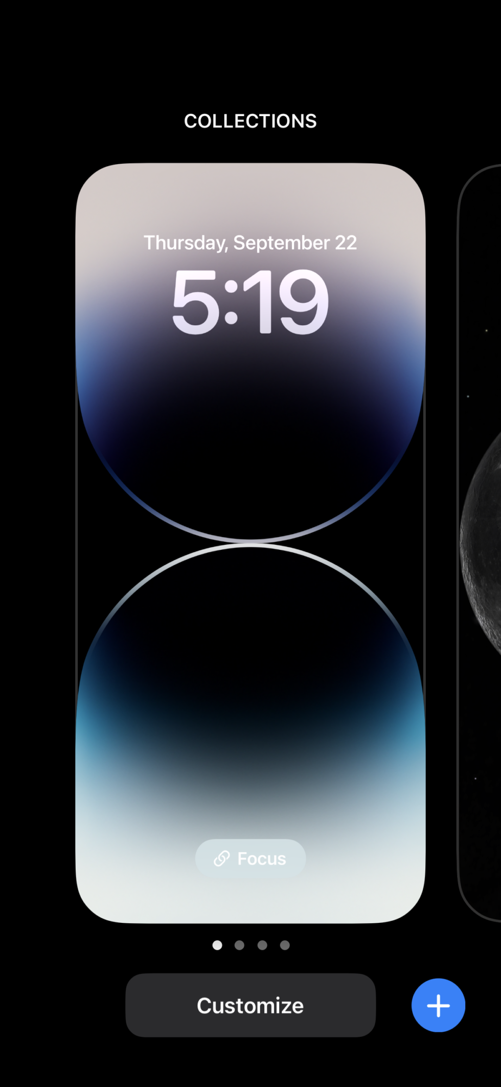
This is the picker you get when you long-press on your lock screen. [credit:
Samuel Axon ]
To start playing with these customizations, you just long-press your finger on the lock screen. This
brings you to an interface with horizontally scrolling cards, each one representing one of your custom
screens.
At the bottom, there are three important buttons. You can tap “Focus” to change the Focus mode that turns
on when this lock screen is active. You can tap “customize” to change your widgets, fonts, wallpapers,
and more. And there’s a “+” button to add a new custom lock screen to the row of cards.
It starts with wallpapers
When you hit the + button, a panel pops up to offer you a variety of wallpaper possibilities. These
options fall into a few buckets. There are color gradient wallpapers, where you pick a general color
theme and define some attributes of a simple gradient. (It looks nicer than it sounds, actually.)
There are collections, which are a bit like Apple’s previous approach to iPhone wallpapers: premade
patterns in a few different color options.
You can also make a wallpaper out of emojis on a grid or in a pattern across the screen, and you can even
pick which emojis to display. You can choose up to six emojis to include in the wallpaper, using Apple’s
standard emoji-picking interface.
-
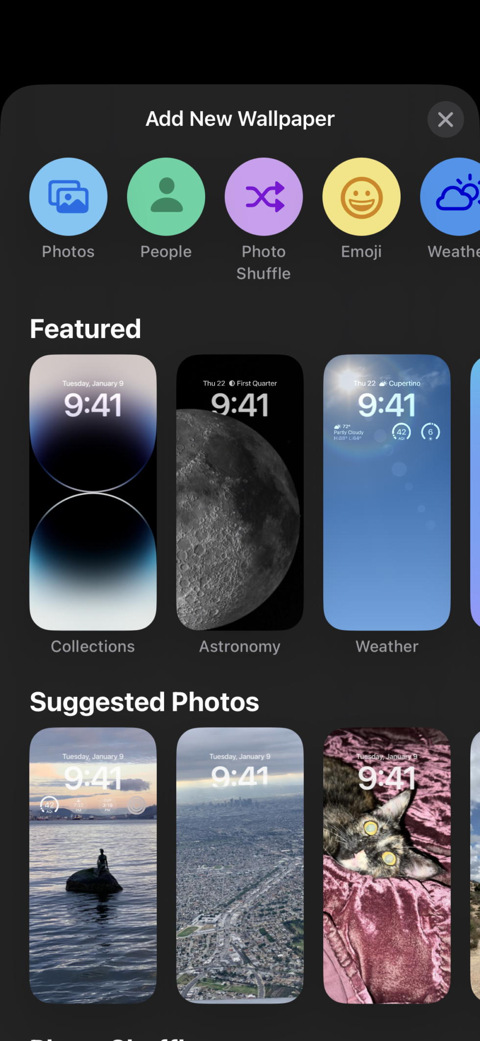
This is the wallpaper picker panel you get when you start creating a new lock screen.
[credit:
Samuel Axon ]
My personal favorite bucket for wallpapers is the “Weather & Astronomy” category. These provide
little in the way of customization, but they’re quite snazzy. The obvious one here changes the wallpaper
visuals to match the live weather conditions in your area—and said visuals look like the ones that
already paint the Weather app.
There are also dynamic wallpapers for the Earth, moon, and solar system. The solar system one shows the
actual current relative locations of the planets as they orbit the sun, while the Earth one shows your
location on a globe with a green dot, amidst live-updating cloud cover that reflects conditions around
the globe.
The moon and Earth ones animate to different angles as you move from the always-on display to an active
lock screen and then swipe for the home screen. It’s a fun effect, and the moon wallpaper in particular
looks amazing on OLED iPhone screens.
-
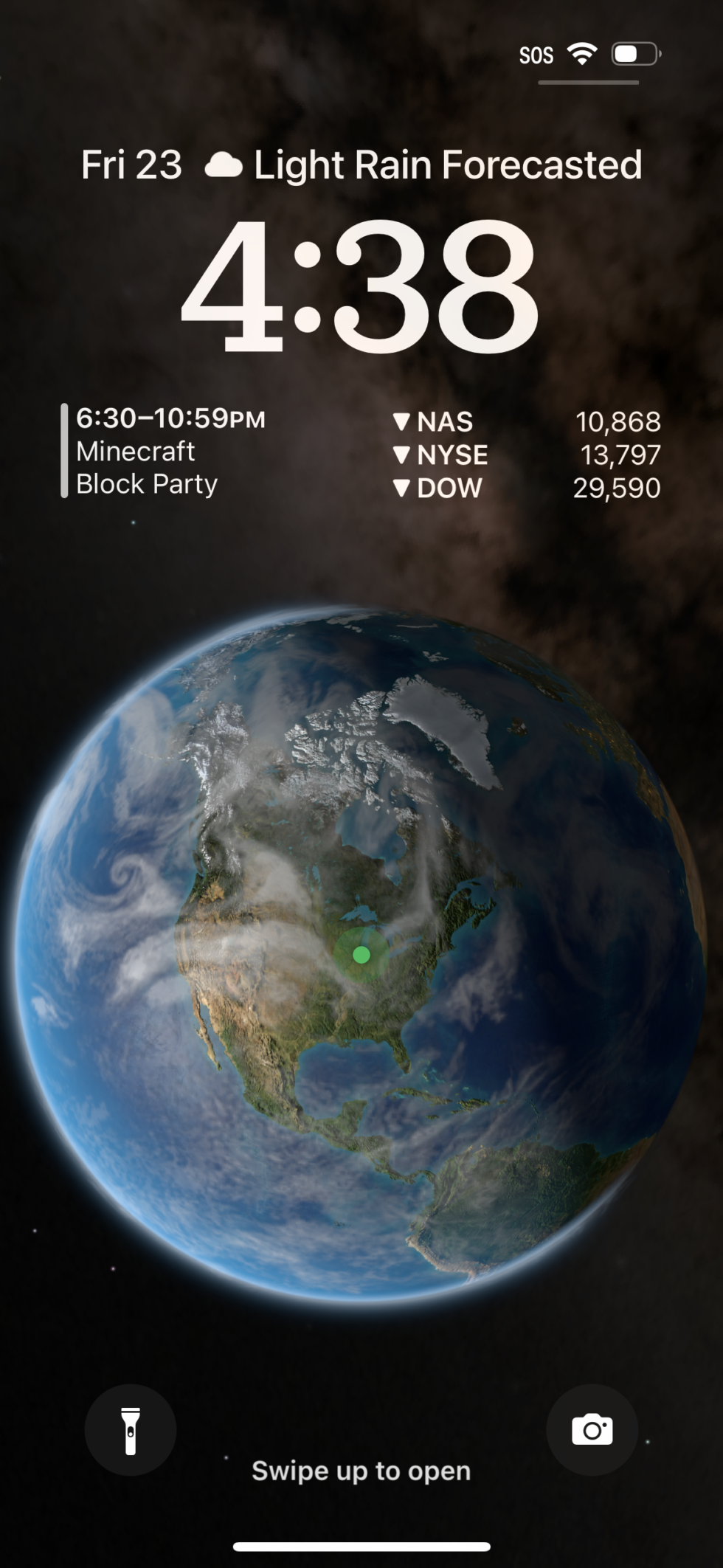
One variation of the Earth wallpaper. [credit:
Samuel Axon ]
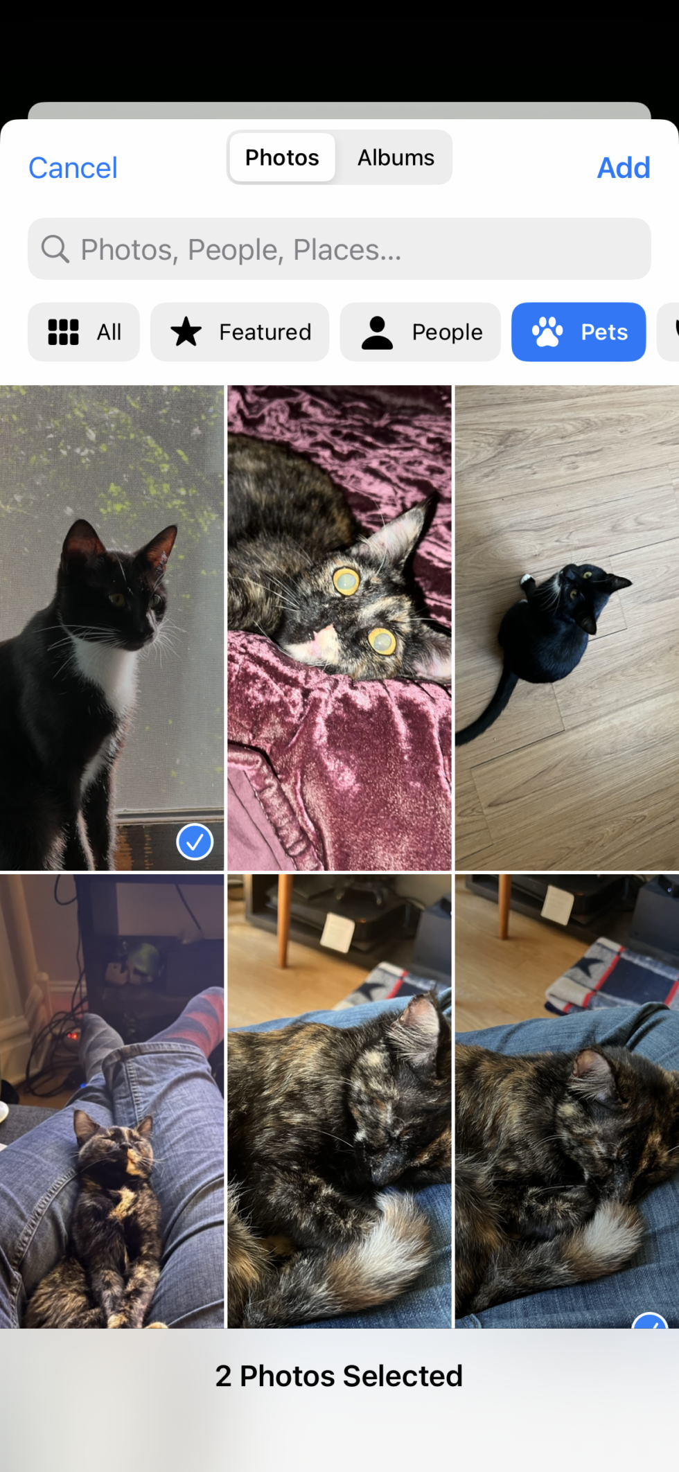
But as neat as those are, I imagine most people will choose to go with the wallpapers that use photos
from your library in the Photos app. Tapping “Photos” gives you a choice between individual photos on
your phone.
Using machine learning, the iPhone analyzes all the photos in your library so you can be presented with
“Featured” suggestions, which I found to be mostly on the money. There are even subcategories for these
featured suggestions, including people, pets, nature, and cities. And of course, you can browse your
entire photo library and pick any image you’d like.
There’s also “Photo Shuffle,” which is “a dynamic set of photos that shuffle as you use your iPhone
throughout the day,” according to the tooltip. You can set the shuffle frequency to change on tap, on
lock, hourly, or daily. Once again, it presents you with featured photos, and it lets you pick which
categories to include—but you can still manually select each photo from your library.
-
This is the manual photo wallpaper picker, with recommendations and categories. [credit:
Samuel Axon ]
This is as good a place as any to note that for photo wallpapers, Apple uses some neat AI tricks to cut
out major objects in the image, like faces or buildings, and allows them to overlay bits of the time
indicator, creating a neat effect. It’s shocking how well this works, actually. Unfortunately, it
doesn’t work when you add widgets below the time. Except for that limitation, you can toggle this on and
off at will.
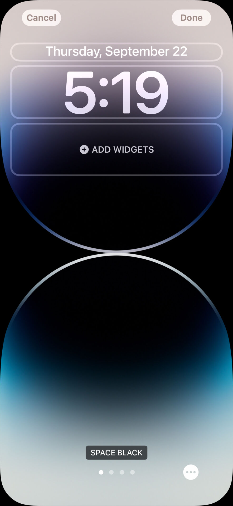
Once you’ve picked your wallpaper, you’re taken to the full lock screen customization view.
Customizing the lock screen
The screen you see when you customize a newly created lock screen is the same one you get when you tap
the “Customize” button on an existing lock screen.
Swiping along the screen swaps between different options for your chosen lock screen category, and what
that means varies by the category. For photos, it moves between different filters like “black &
white,” “natural,” and “duotone.” For the astronomy wallpapers, it cycles through different viewing
angles on the stellar bodies in question. And for emojis, it changes the grid size and pattern.
Beyond wallpapers, every lock screen has three distinct elements you can customize: the text field above
the clock, the clock itself, and a widgets dock below the clock.
The above-clock field can include text- and symbol-based information from Weather, Calendar, Clock,
Fitness, Reminders, Stocks, and any third-party apps that are supported. This is a good place for static
information that can be conveyed in a number or a couple of words.
-
This is the top-level customization interface you get when you add a new lock screen, or
customize an existing one. [credit:
Samuel Axon ]
Moving down to the clock, you can tap on it to bring up font and color options. There are eight font
options, but a few of them are quite similar to one another. Once you’ve settled on a font, you can also
pick a color from a horizontally scrolling list. iOS starts the list off with 14 suggested hues based on
the colors that it detects in the wallpaper you chose, and you can use a slider to adjust the saturation
of each. Alternatively, you can scroll all the way to the end of the list to use a proper color picker;
you’ll even find RGB sliders and a field for entering a hex value.
Each UI element (including widgets) follows a limited, monochrome visual language, so it all looks pretty
similar in practice, regardless of your customizations. The color picker for the clock also changes the
color of the text field above the clock and of the widgets below it.
Bizarrely, the color selection does not apply to the lock screen’s flashlight and camera
buttons, which still cannot be removed. I find it jarring to have these two non-removable, permanently
white elements on a screen that is otherwise uniform in another color scheme. I almost can’t believe
this was intentional, but there it is.
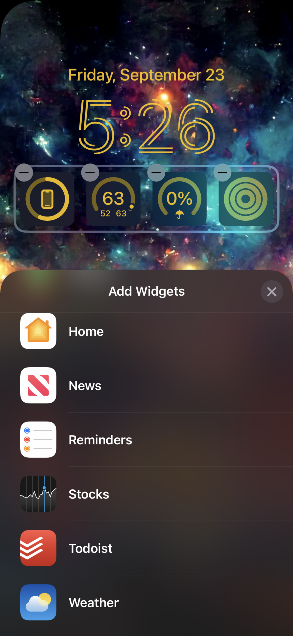
Finally, there’s the widgets dock.
The widgets are a start, at least
The rectangle-shaped widgets dock can hold up to four of the smallest, square-shaped widgets, or up to
two of the double-width rectangular options that offer more detailed information.
The picker for these resembles the one that already exists for adding widgets to the home screen.
Examples of included widgets are your Fitness rings, various pieces of weather information like
temperature, upcoming calendar events or reminders, stocks, and device battery trackers.
Unfortunately, Apple’s offerings of widgets for the home screen feel anemic. There are far fewer than
launched with the home screen’s widgets feature in iOS 14, and we noted back then that those
widgets were already anemic. The options Apple has provided for its preinstalled apps are as barebones
as it gets, so that leaves things up to third-party app developers.
But with iOS 16’s relatively rocky beta period and short-notice launch, the list of third-party apps that
offer great home screen widgets remains relatively small.
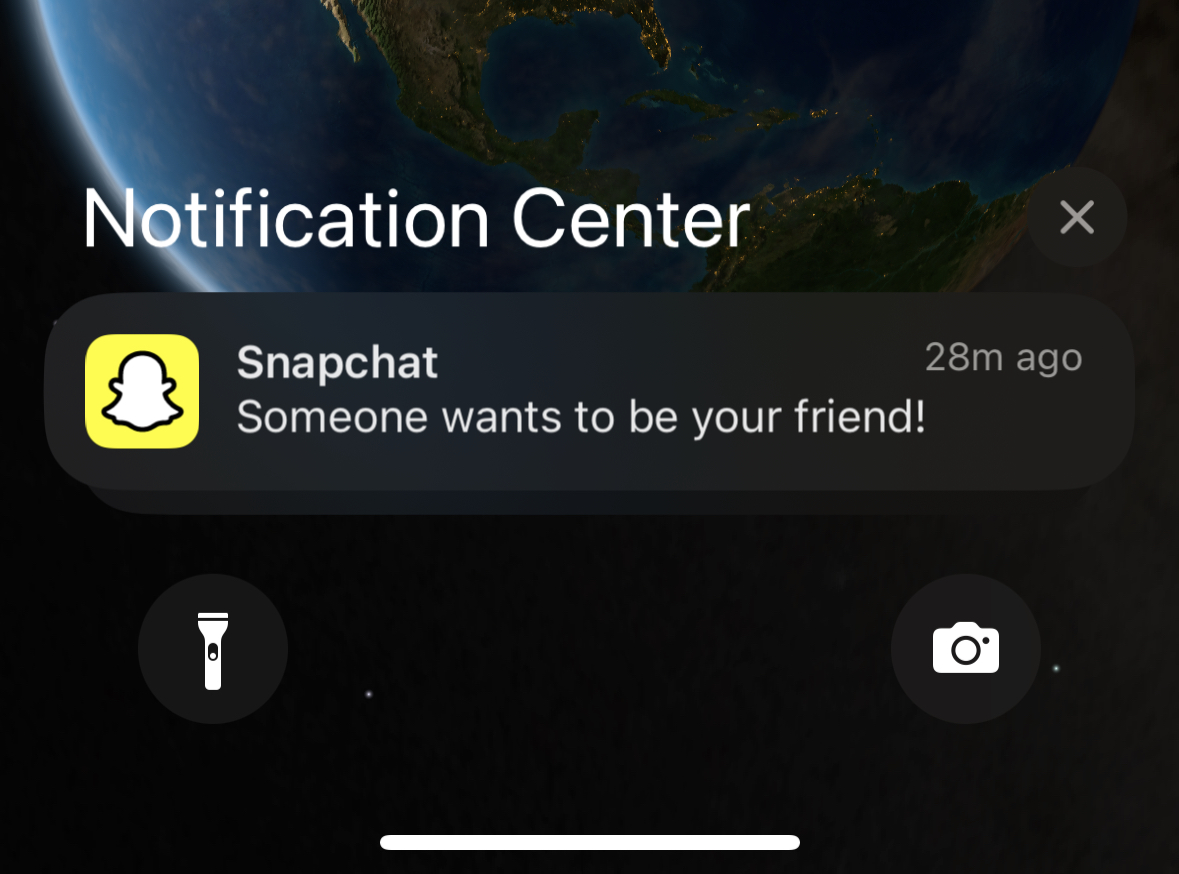
I have 387 apps installed on my personal iPhone, and only two of them offer any kind of lock screen
integration at this writing: Todoist and Snapchat. Your mileage may vary, of course, but I doubt it will
be significantly better.
-
The widgets apps list is very, very short. This is most of it, right in this small view.
[credit:
Samuel Axon ]
All that is to say that while Apple has provided a sturdy skeleton for home screen widgets (provided
you’re cool with little to no interactivity, of course), it’s all bones and no meat right now. But that
skeleton is so strong, and the demand is so high, I expect things will change soon.
The situation is likely to improve once the delayed Live
Activities API rolls out. Live Activities will allow apps to serve up much more detailed,
live-updating visuals and information outside of the widgets dock, in the middle or bottom of the
screen. Apple has used this to rebuild the lock screen music player, which shows album art and critical
controls during playback.
The API will be available to the wider developer community sometime before the end of the year, Apple
says. Some partners have already demonstrated what they plan to do with it; for example, Uber will show
a progress bar, pickup time estimates, driver name, car make and model, and license plate—all the stuff
you need to find your Uber when it arrives—on the lock screen with Live Activities. Previously, you had
to dig into the app to get this information.
But until the API rolls out, the lock screen still feels quite static, even though there are a few ways
to make it feel more your own.
Notifications have been redesigned
To make room for features like widgets and Live Activities, Apple has moved app notifications to the
bottom of the screen, where they roll in from below, one by one.
This follows Apple’s recent trend of moving a lot more UI stuff to the bottom, where you can
more easily reach it with your thumb on large phones. It wasn’t long ago that the company did the same
with Safari’s search bar.
Some people hate this trend, but with phones being the size they are now, I think most critical
intractable UI elements need to be at the bottom of the screen. Anything else is a legit usability
issue. So I welcome this change—and not just because it makes more room for widgets and other
customization in the middle of the lock screen.
There are also three different notification views on the lock screen, and you can choose your favorite in
the Notifications panel in the Settings app. The options include count, stack, and list. List simply
puts the rectangle-shaped notifications in a straightforward, top-to-bottom list. Stacks adds a depth
effect so the top one covers the top half of the second one (and so on) as they fade into the background
towards the bottom. And count just tells you how many notifications you have until you tap for more
details.
Notifications now come in at the bottom of the lock
screen. (credit: Samuel Axon)
The default seems to be stacks, and that feels like the most sensible one to me. But count is good for
users who want a distraction-free lock screen, and the list view is most similar to older iPhone
notifications.
Nothing has changed about the behavior of notifications—they’ve just been moved and given a few different
presentation options in their updated location on the lock screen.
Focus
Focus was the big feature last year, so it makes sense that there are refinements and additions in the
next major update—especially since the lock screen has been designed to work closely with Focus.
When you’re looking at your lock screen, a long press followed by a quick swipe to the left or right
swaps between your previously created lock screens. Since each lock screen can automatically be
associated with a Focus mode, this is a more elegant way to switch modes than the old method of digging
into the Control Center. (Though you can still do that, of course.)
-
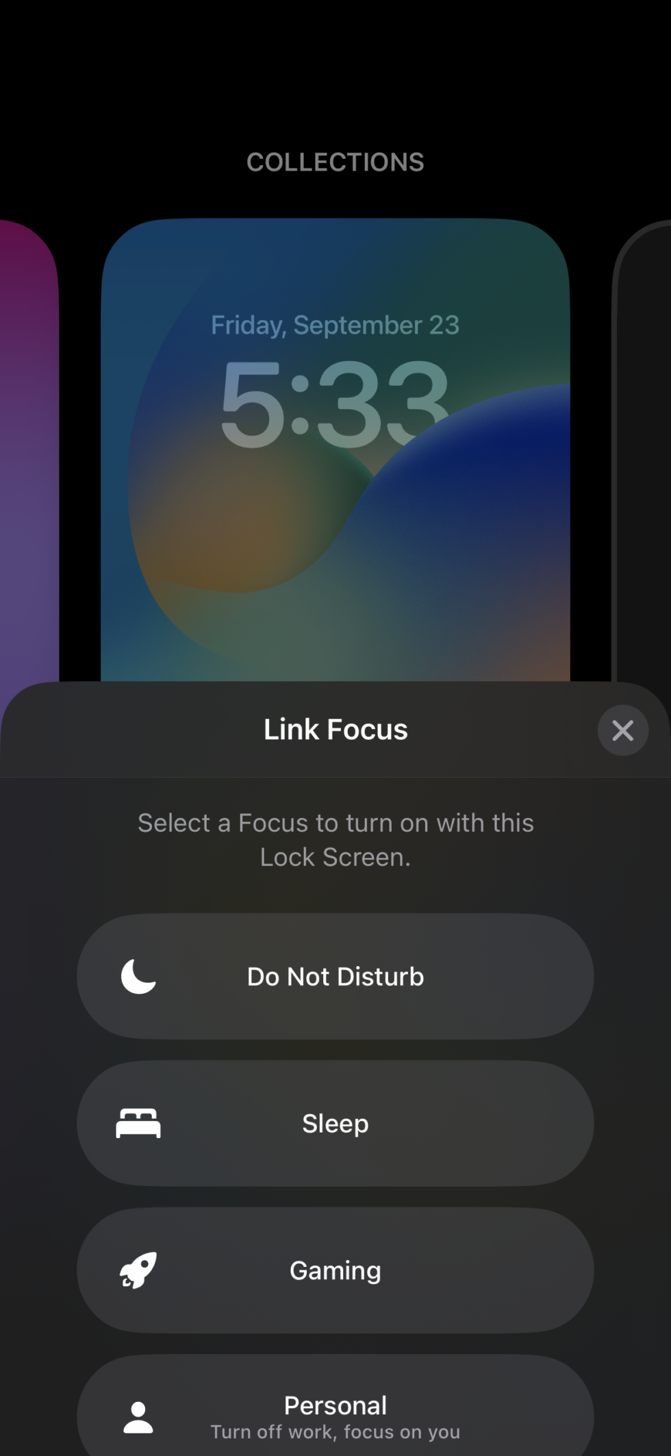
You can link a specific Focus to a specific lock screen in the lock screen customization
menu. [credit:
Samuel Axon ]
If you have an Apple Watch, you can also sync your Watch face with your Focus, so in a way, swiping
between home screens is now the baseline for adjusting the behavior of your entire mobile Apple software
experience.
There are some other interesting changes to Focus beyond the tie-in with lock screens. Setting up a Focus
is a lot easier now because you can block apps or contacts within a blocklist rather than an allowlist.
Previously, you had to manually add each app or contact you wanted to receive notifications from when a
Focus was active. Obviously, that wasn’t always optimal, depending on how many you wanted to add. Now
you can pick which way to go at it, which is a helpful change.
Apple has tweaked the Focus setup experience in various ways beyond that, making it a bit more
streamlined. And when you’re setting up a Focus, you’ll receive suggestions for what to include in your
lock screen or home page for that Focus.
Focus filters
There’s one major new Focus feature that’s not associated with the lock screen: Focus filters.
Previously, Focus chiefly affected notification behaviors and your home screen layout. But now you can
define some different behaviors within apps like Mail or Safari, too. For example, you can see only
emails from your personal email account when you’re in an after-work Focus mode, or you can define which
Safari tap groups show up in different Focus modes.
As with the lock screen widgets, the available applications for this are limited at launch. But Apple is
releasing a Focus filter API for developers, so if third-party apps go all in, it will be a big deal for
Focus.
When Apple first launched Focus last year, I thought it was neat (and I do use Focus in my day-to-day
life) but limited. The idea of Focus digging into apps themselves greatly expands the appeal and
practicality of the concept, and I’m excited to see where this goes, even though the current offering is
small in scope.
Beyond the lock screen
While the lock screen and associated notifications and Focus changes are the big story for iOS 16, Apple
has made smaller changes throughout the OS and its various pre-installed apps. We won’t get into every
one of those here (if you want a list, Apple has published a thorough one), but I’ll cherry pick a few I
think are particularly worth noting before we wrap up.
Mail and Messages
In both Messages and Mail, you can now undo sent messages. In Messages, you have up to two minutes, but
this only works if the person on the other end is using iOS 16. Users on Android or older versions of
iOS receive the messages normally. And even if you do unsend a message that went to an iOS 16 recipient,
they’ll still see that you unsent something; they just won’t see what it was.
In Mail, you have up to ten seconds by default. You can increase the time to 20 or 30 seconds within the
Mail panel in the Settings app. You can also disable this feature entirely.
In Messages, you can also edit a message up to 15 minutes after you first sent it. Again, recipients have
to be using iOS 16. In this case, recipients can see a record of your edits.
In Mail, search has been improved in several small ways, you can add rich links to emails, and you can
schedule emails to be sent at a later time. You can also swipe on emails to set a follow-up reminder for
any date or time from that email. It’s still not as robust as the “snooze” option found in many Inbox
Zero-oriented email apps, and I really wish Apple would just do that already.
Maps and transit
Apple Maps, once the rightful butt of jokes for its drastic inferiority to Google Maps, has really come
into its own over the years. At one time, I would never have considered switching, but I’ve been almost
exclusively using Apple Maps for the past two years and haven’t looked back.
That said, there was one feature whose absence continued to baffle me: multi-stop directions. In Google
Maps, you can plot a route that hits multiple points along the way. Now you can in Apple Maps too, at
least for driving directions. So if you’re planning a whole set of errands instead of just going from
point A to point B, it’s a lot easier now.
-
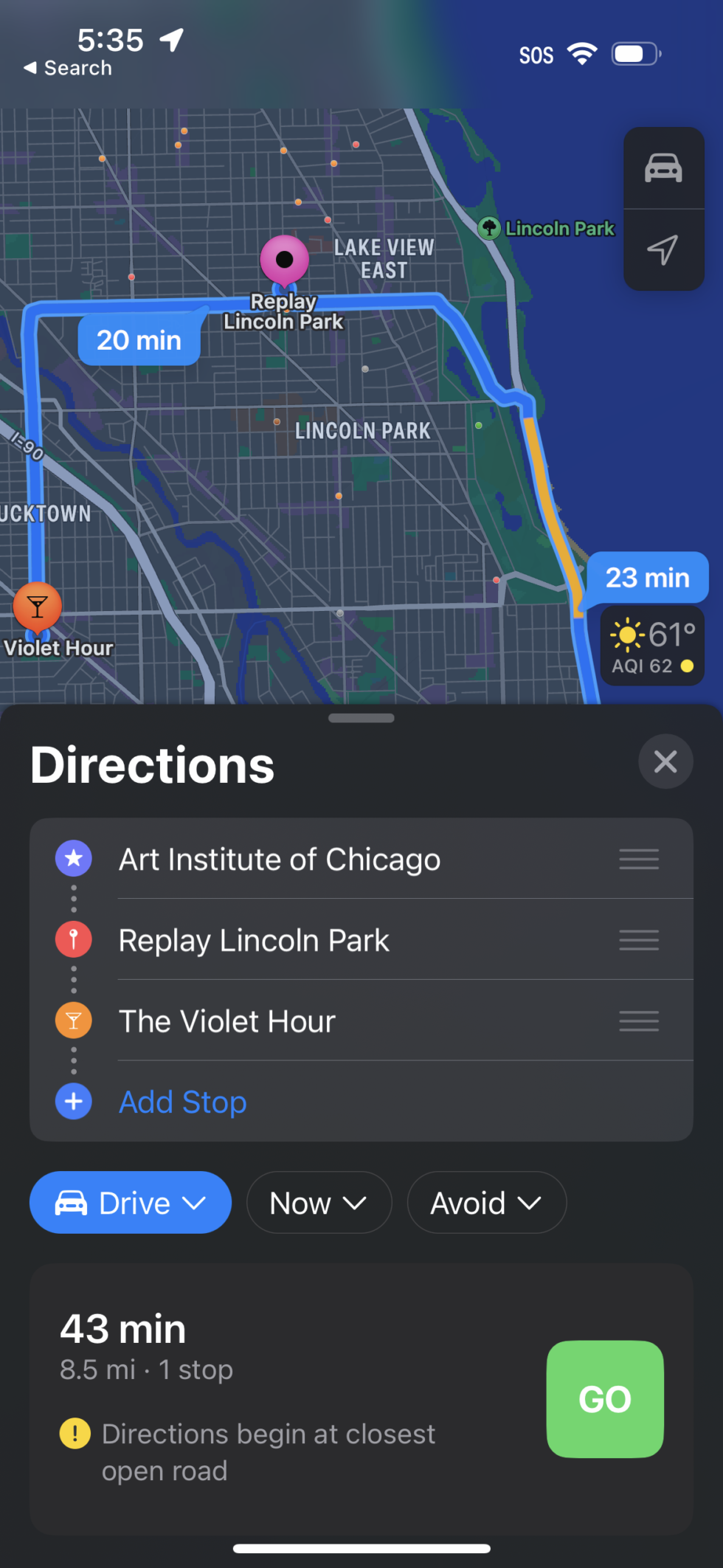
Multi-step directions are now possible in Maps. Finally! [credit:
Samuel Axon ]
The lone feature from Google Maps that I still personally miss is the hour-by-hour live updates on how
busy locations like bars and restaurants are. Add that, Apple, and I’ll never open Google Maps again.
There are also some improvements to transit directions, and you can check transit fares and add funds to
your transit cards directly from Maps.
Safari and passkeys
iOS 15 was a big one for Safari, but iOS 16? Not so much. There are some minor improvements to tabs and
tab groups, including the ability to pin tabs. Extensions and website settings can sync between devices.
The most notable new Safari feature is passkeys, which is also coming to some supported iOS apps.
Passkeys allow you to log in to websites or app accounts using just Face ID or Touch ID, without
creating, tracking, or remembering passwords. The concept is based on the FIDO standard, developed in an
industry-spanning partnership between Apple, Google, and Microsoft. It’s meant to replace passwords
outright with a digital signature that exists locally on your device (but that can be synced via the
cloud). This signature can only be accessed with the method you use to log into your device itself—in
this case, Face ID or Touch ID.
We’ve
written about the thought process behind FIDO and passkeys before. The iOS 16-specific story
here is that iOS 16 is one of the first major attempts to implement this feature at a large scale, but
like so many other big iOS 16 features (lock screen widgets, the iPhone 14 Pro’s Dynamic Island, the
Focus API, Live Activities, and so on) its appeal is highly dependent on developer adoption.
That’s minimal so far, but with such broad backing from big tech and such a strong value proposition, I’m
expecting passkeys to grow long legs in the coming months and years.
A few other notables
Here’s a quick grab bag of some other changes I particularly liked:
- The numeric/percentage battery indicator has returned! It’s not on by default, but you can turn it
on in Settings. It replaces the vague and (for me at least) anxiety-inducing graphic battery
indicator with a static battery graphic with a number overlay. I really like it. - You can use the same tech Apple uses to overlay people, pets, et cetera on the clock in the home
screen—but on your own photos within the Photo app, plucking subjects out of the scene. Neat! - There’s a new, tappable Spotlight search field at the bottom of the home screen, just above the
dock. I don’t understand why this would be desirable, since you could always just swipe down on the
home screen to use Spotlight. Fortunately, you can turn it off in Settings. - You can turn on Android-style haptic feedback for keyboard typing. It feels good and long overdue. I
turned it on and plan to stick with it. - There are a number of new family management features, including the ability to approve kids’ Screen
Time requests via Messages and a new device setup process for kids’ devices. - There’s a new Safety Check feature for victims of domestic violence.
- Face ID now works in landscape mode.
It’s the little things, really
It’s a challenge to review iOS 16, because some of the biggest features like the Live Activities API or
iCloud Shared Photo Library didn’t make the initial release and are planned for updates later this year.
And many of the changes that did come at launch are dependent on third-party developer support to become
truly useful.
But most of what Apple previously announced for the lock screen, at least, is here. And fortunately, that
means the biggest expansion of user customization for the iPhone since it launched. And Apple’s
pre-built wallpaper solutions are very cool.
We didn’t have any serious problems with iOS 16. Despite a somewhat rocky beta period, iOS 16 seems much
lighter on notable annoyances or bugs than some other recent annual updates. For that, we’re grateful.
iOS 16 won’t completely change the way you use your iPhone, but it’s full of welcome tweaks and new
customization options. While this could be described as “the lock screen update,” it has enough small
things going on to make it worth installing.
The good
- Lock screen features bring more customization to the iPhone than it’s ever had
- Focus looks to finally become truly useful with in-app integrations
- Small updates like landscape Face ID, keyboard haptics, and the return of battery percentage add up
- Apple’s continued emphasis on safety, security, and accessibility features continues to impress
The bad
- Lock screen widgets are anemic at launch, so they feel more like set dressing than something useful
- The appeal of most of the important features depends on third-party dev support that hasn’t fully
arrived - Several key iOS 16 features didn’t make launch, like family photo libraries and the Live Activities
API
The ugly
- Nothing, really—at least nothing new in this update
Recent Comments