
ELEMENTO UI KIT – Massive Collection of Components, UI Elements & Layouts for Web Design Projects
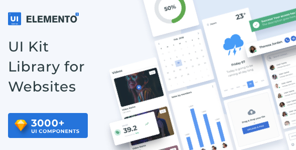
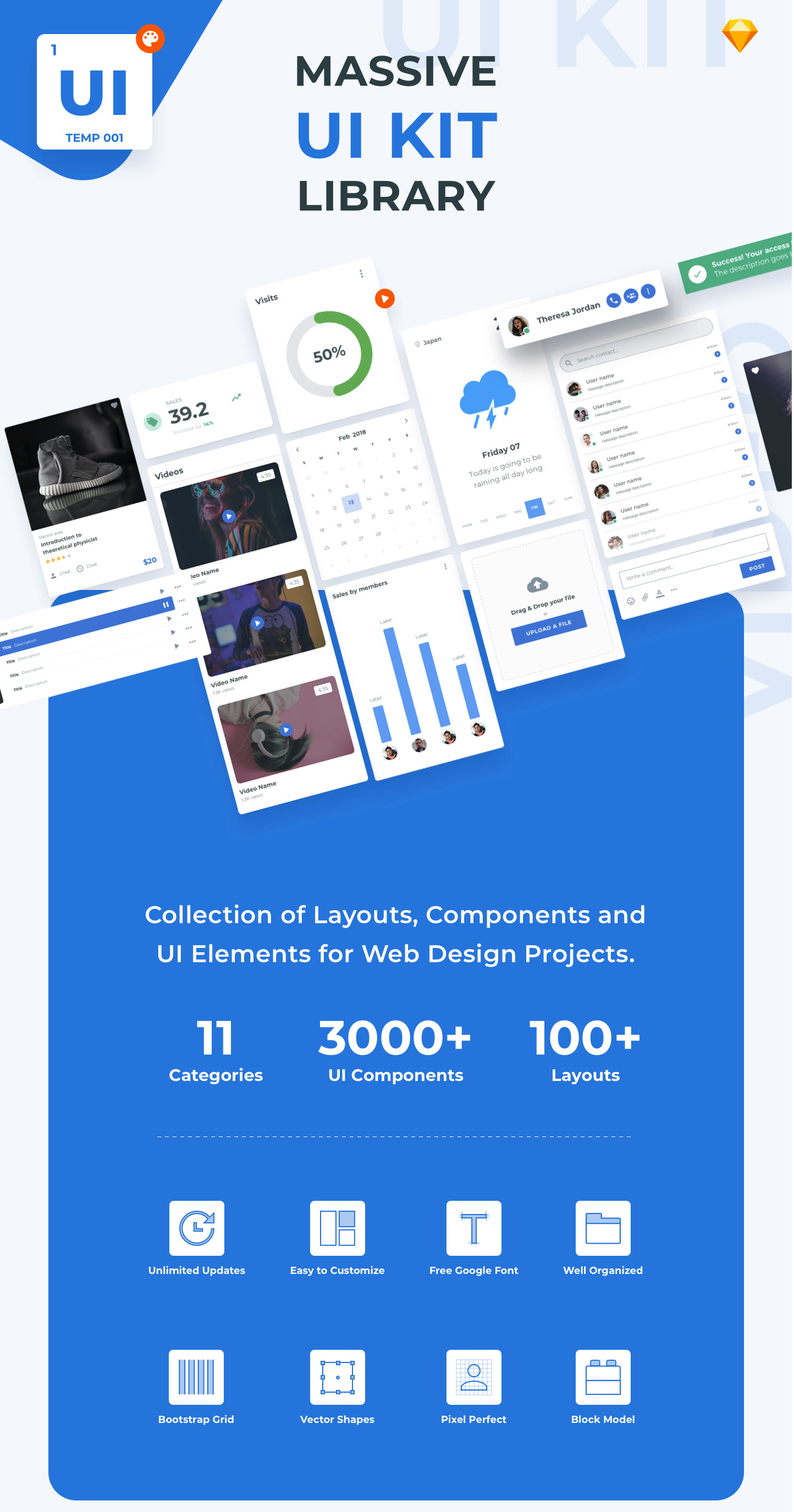
Elemento UI Kit is a Massive Collection of Components UI Elements, and Layouts for Web Design Projects. Carefully crafted all these elements fit together perfectly allowing you to create great designs faster with excellent quality.
All the layouts are really easy to combine and customize, also, you can create your own layout using the hundreds of ready to use components built into this UI Kit.
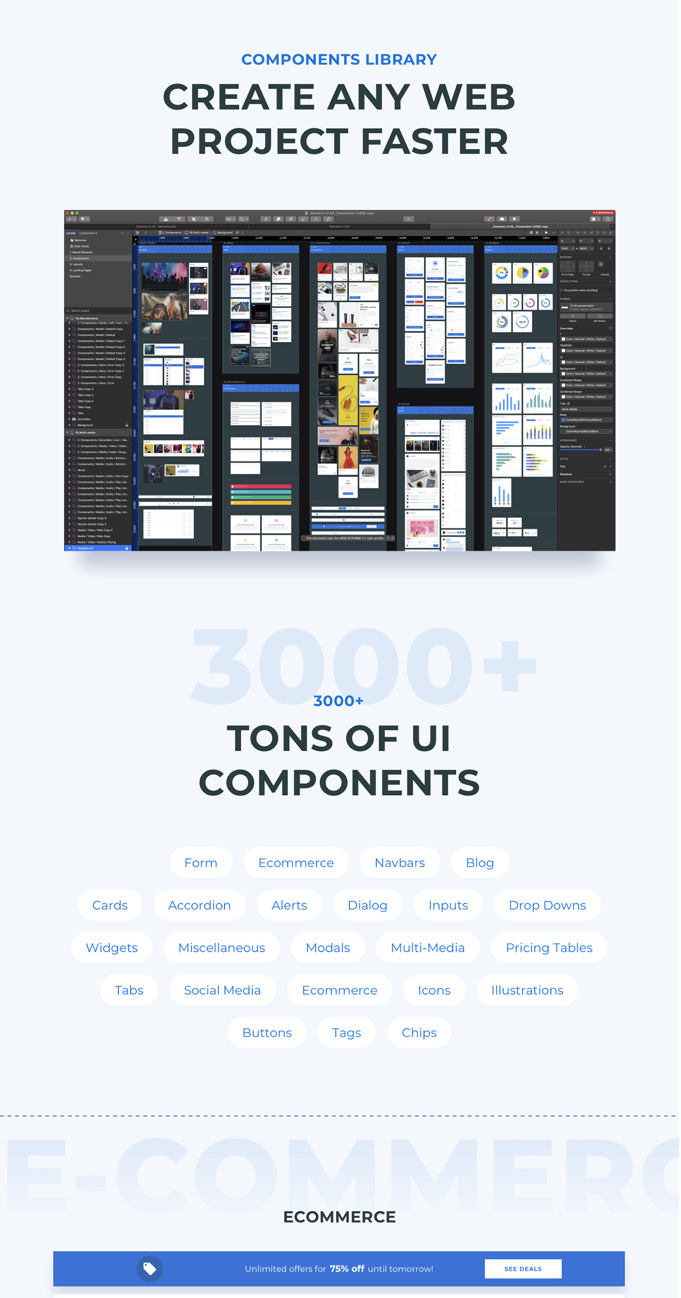
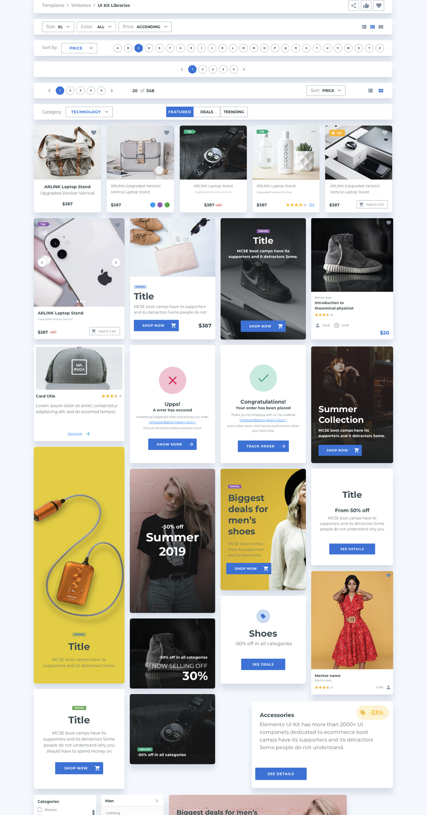
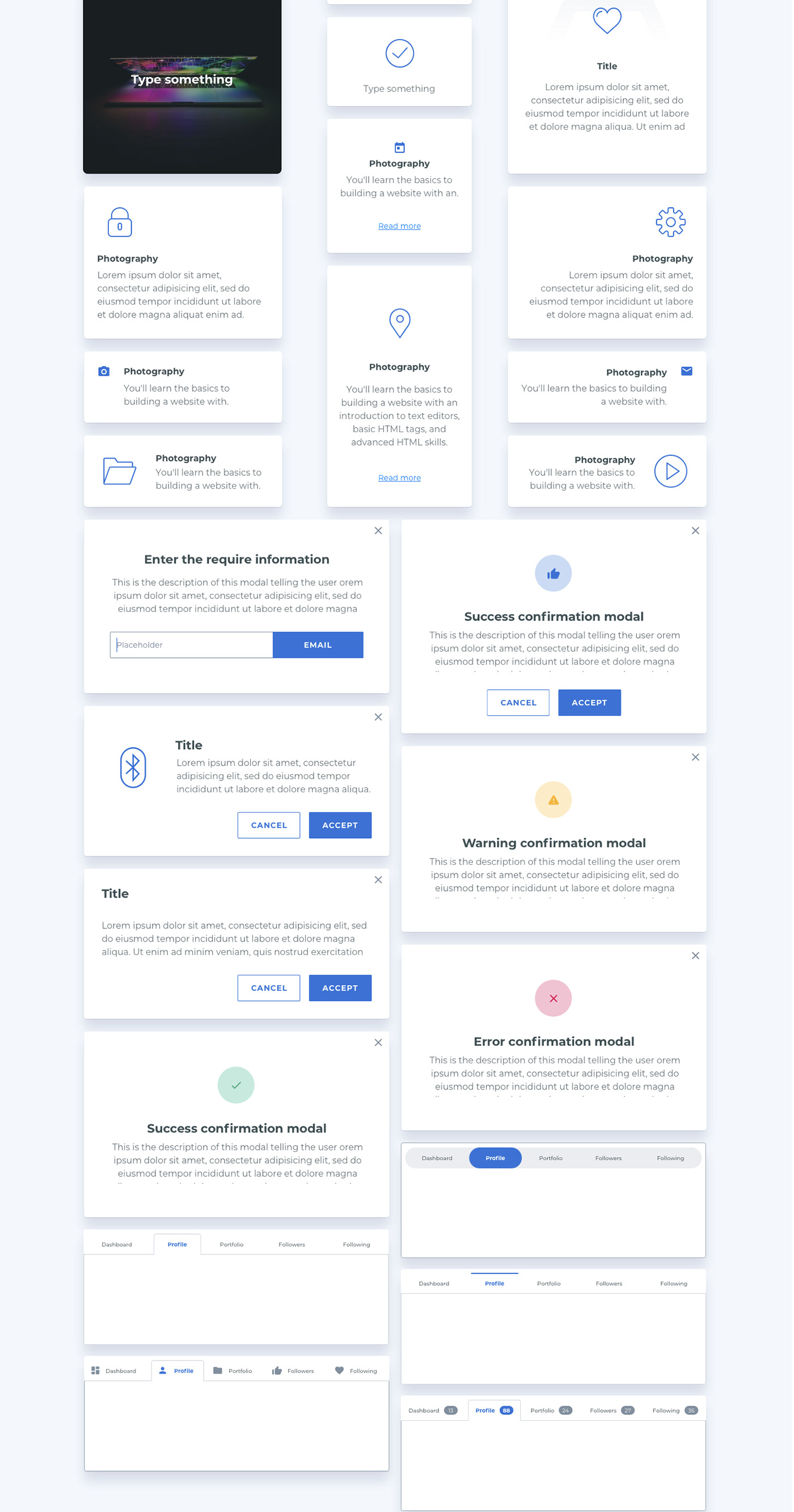
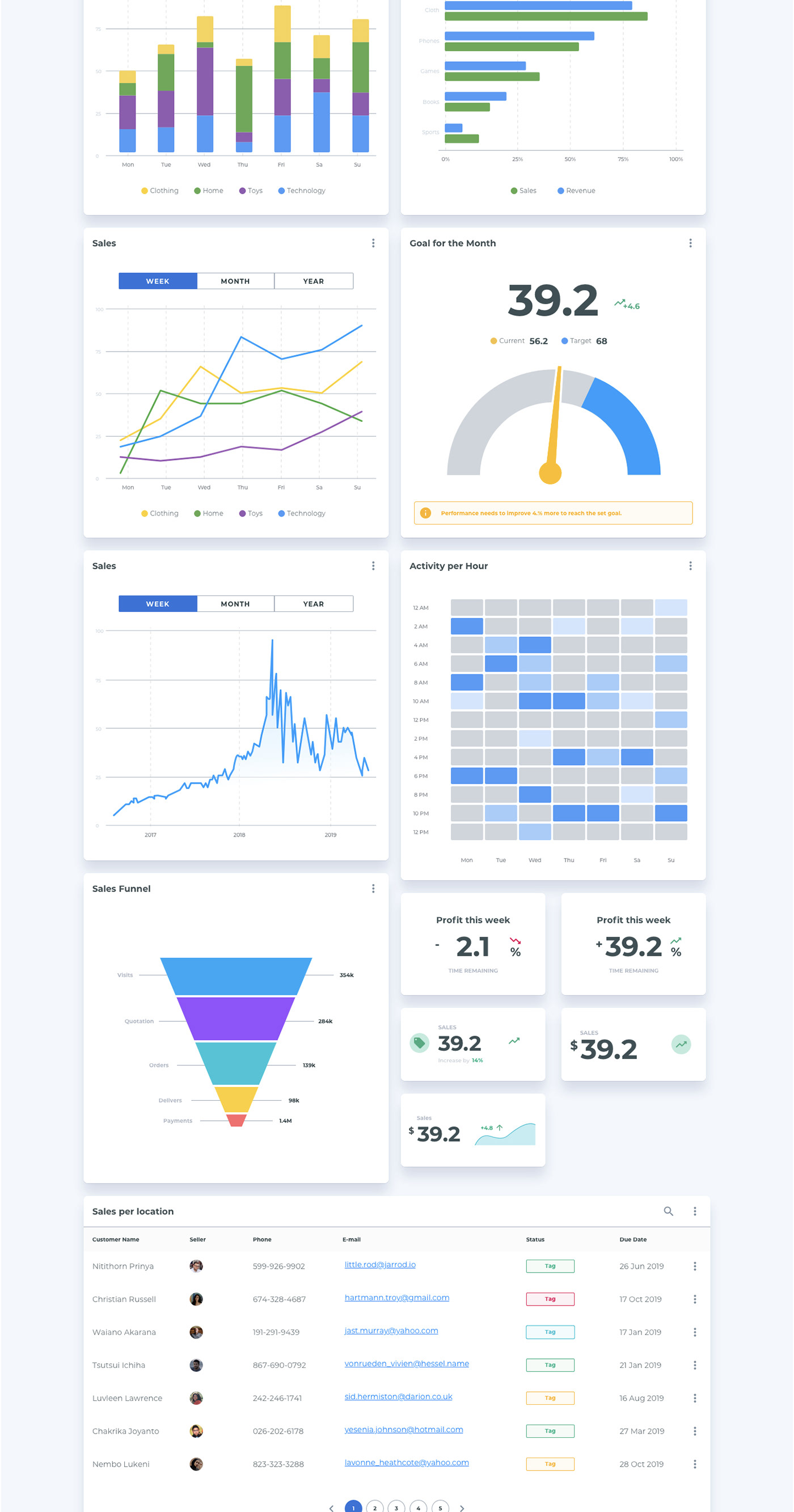
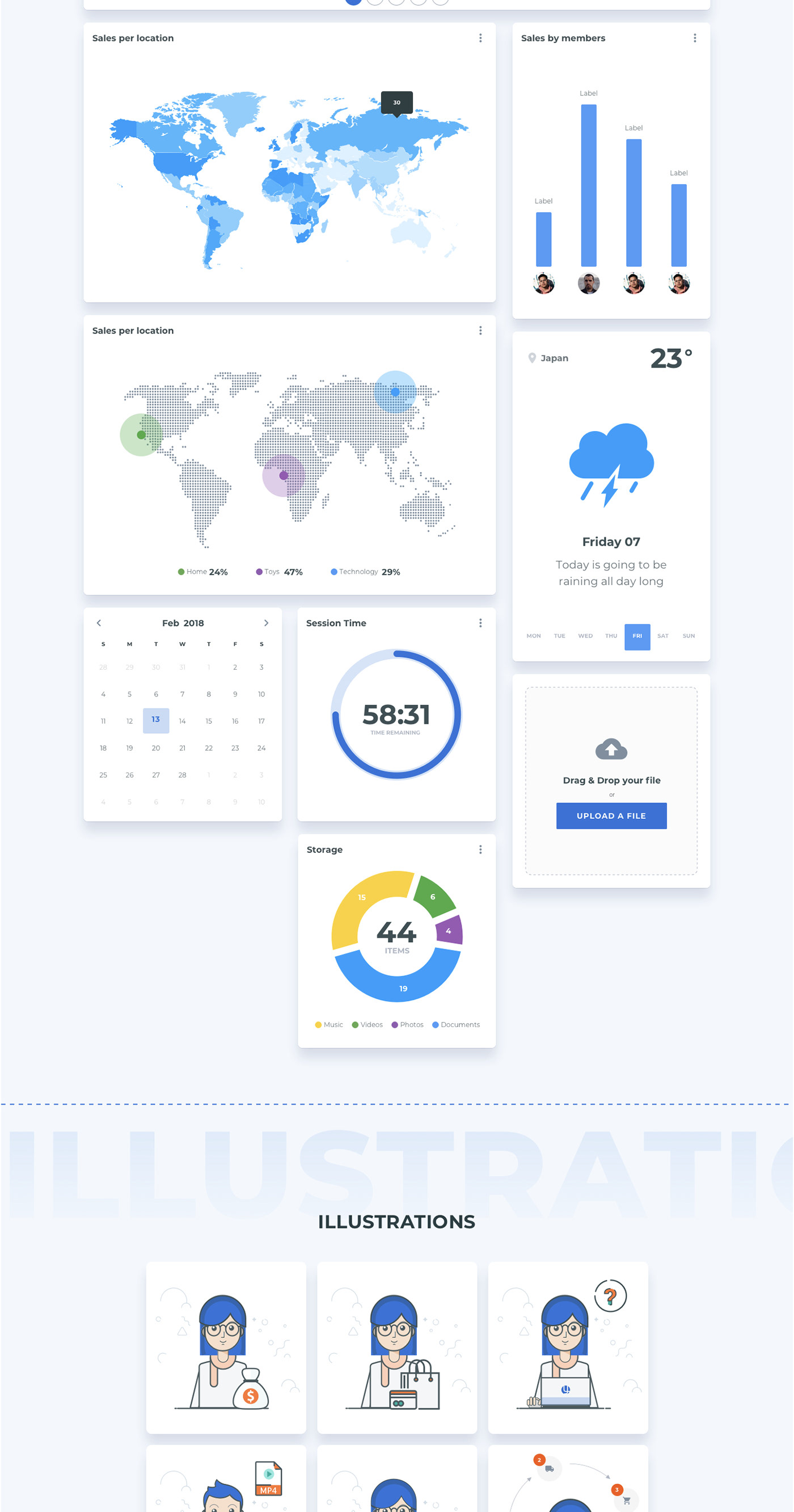
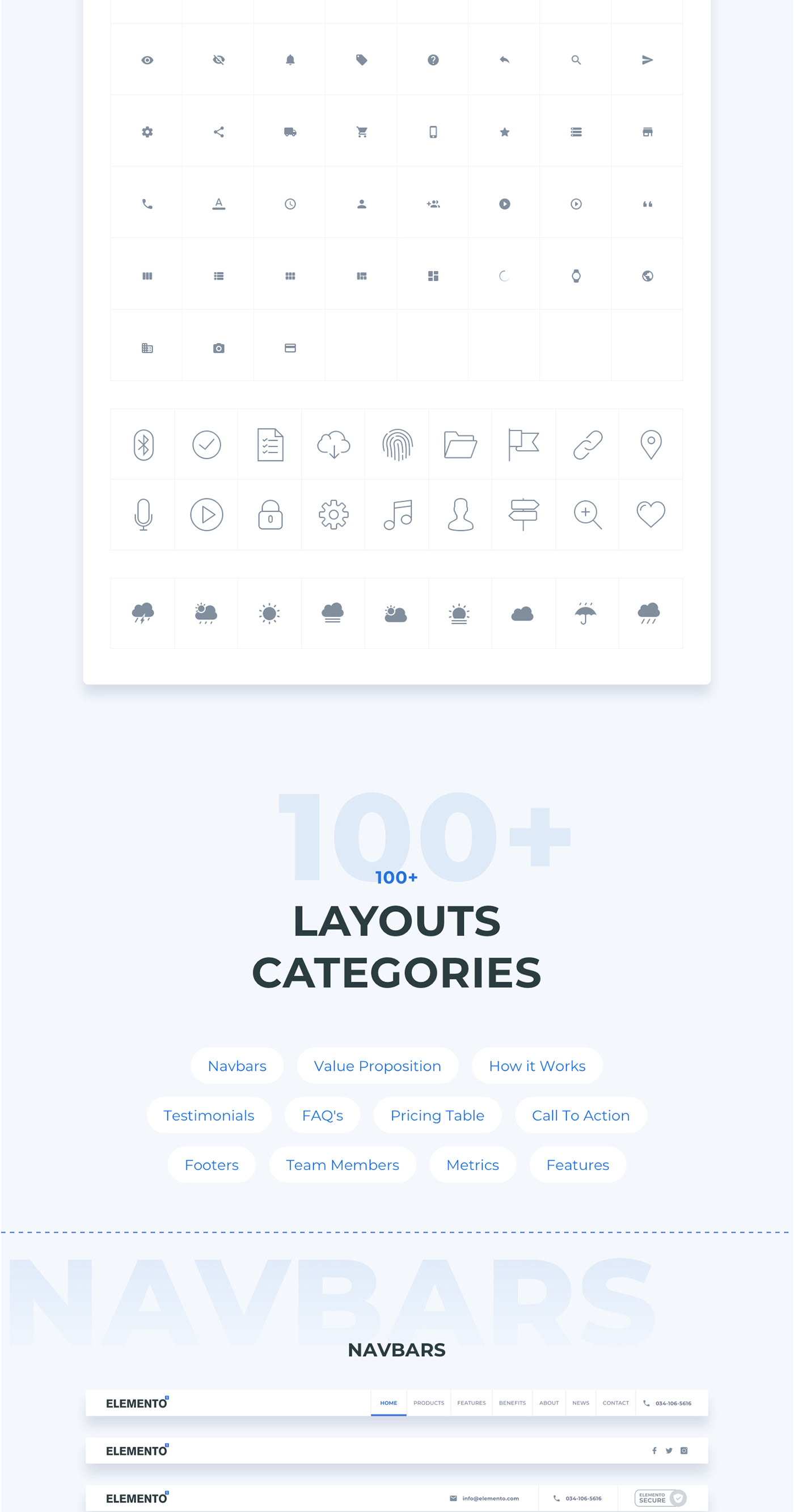
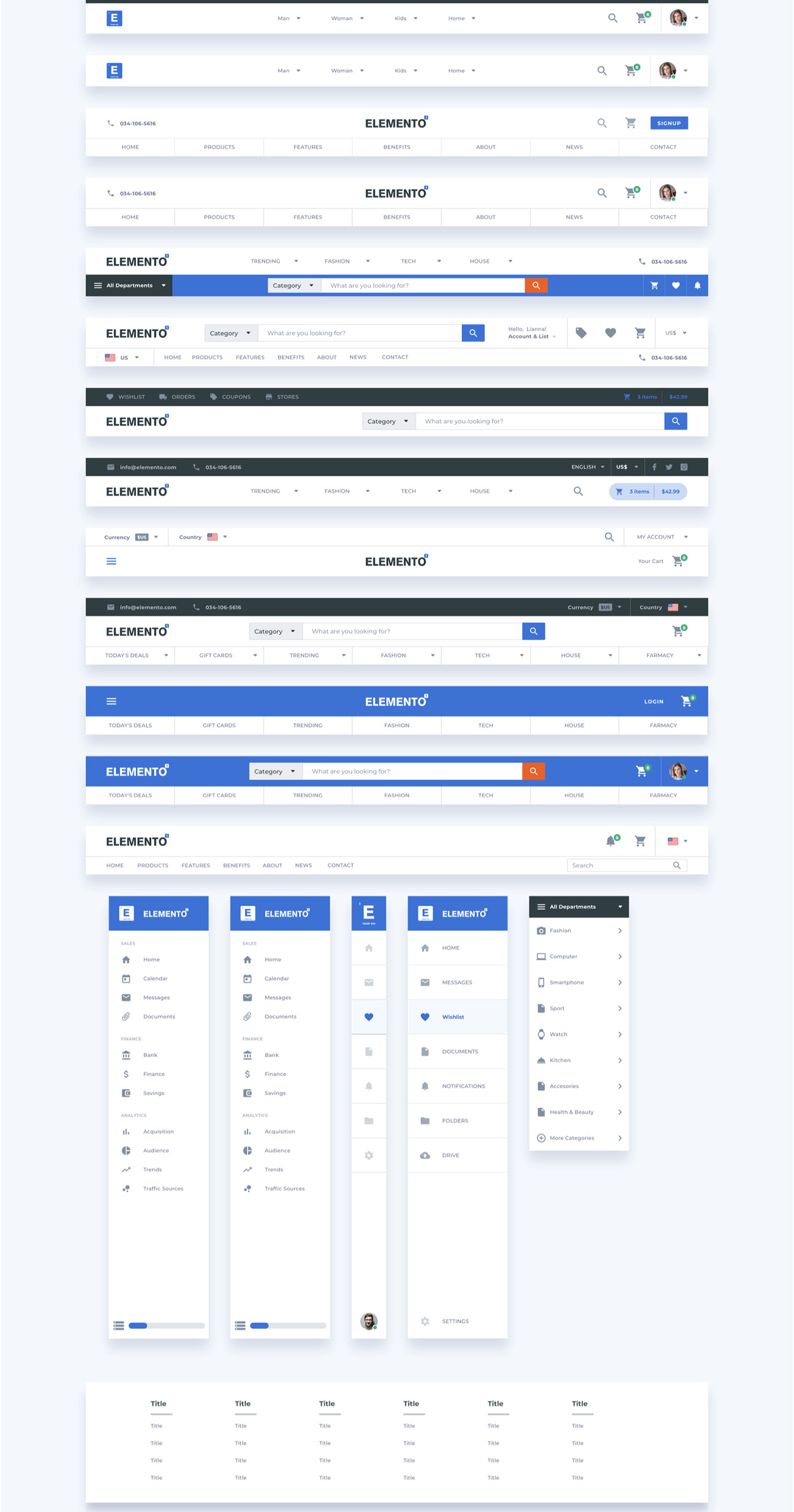
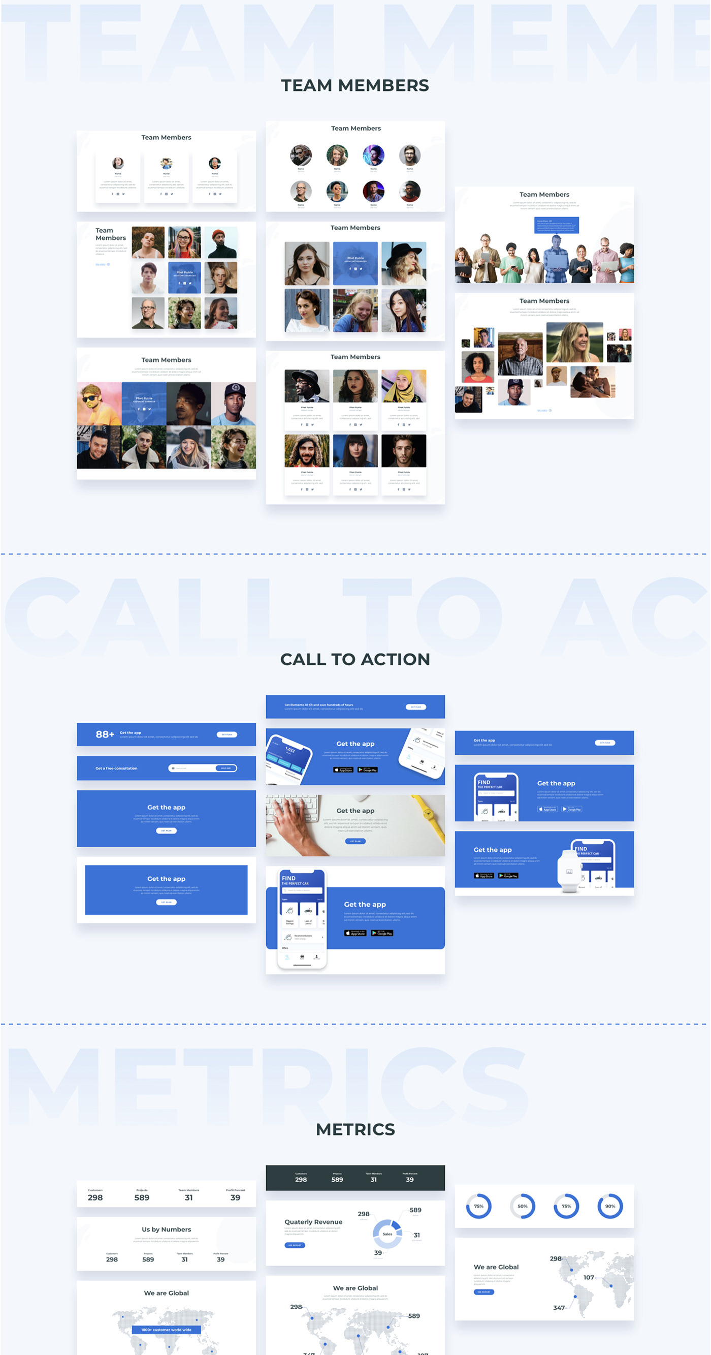
This UI Kit consists of 100 ready-to-use layout sections divided into 11 popular content categories that are composed by 11 components categories.
TEMPLATE FEATURES
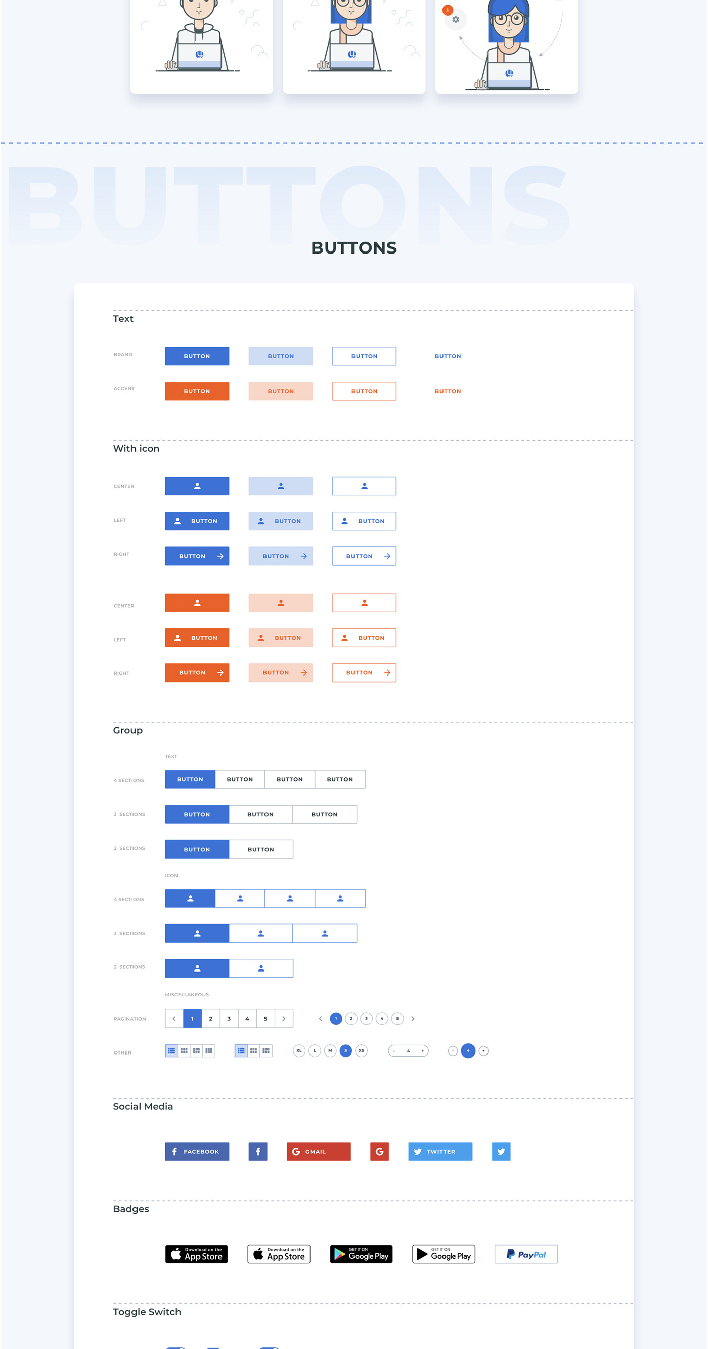
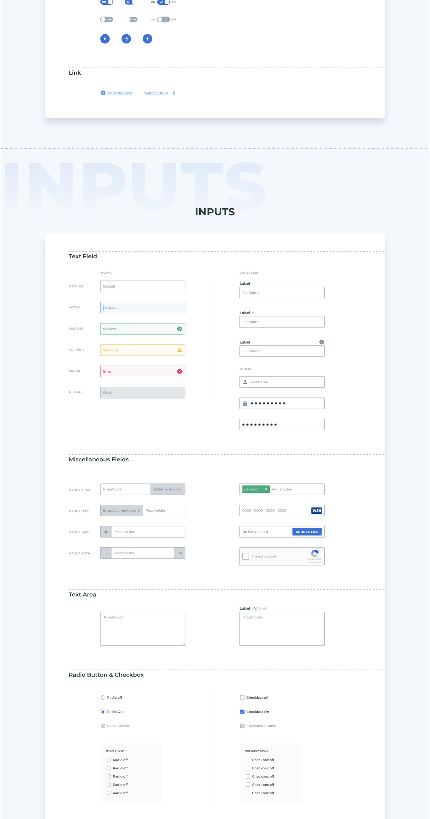
- 3,000+ UI Elements
- 100+ Layouts ready to use
- 11 popular content categories
- 2 Ready to use landing pages
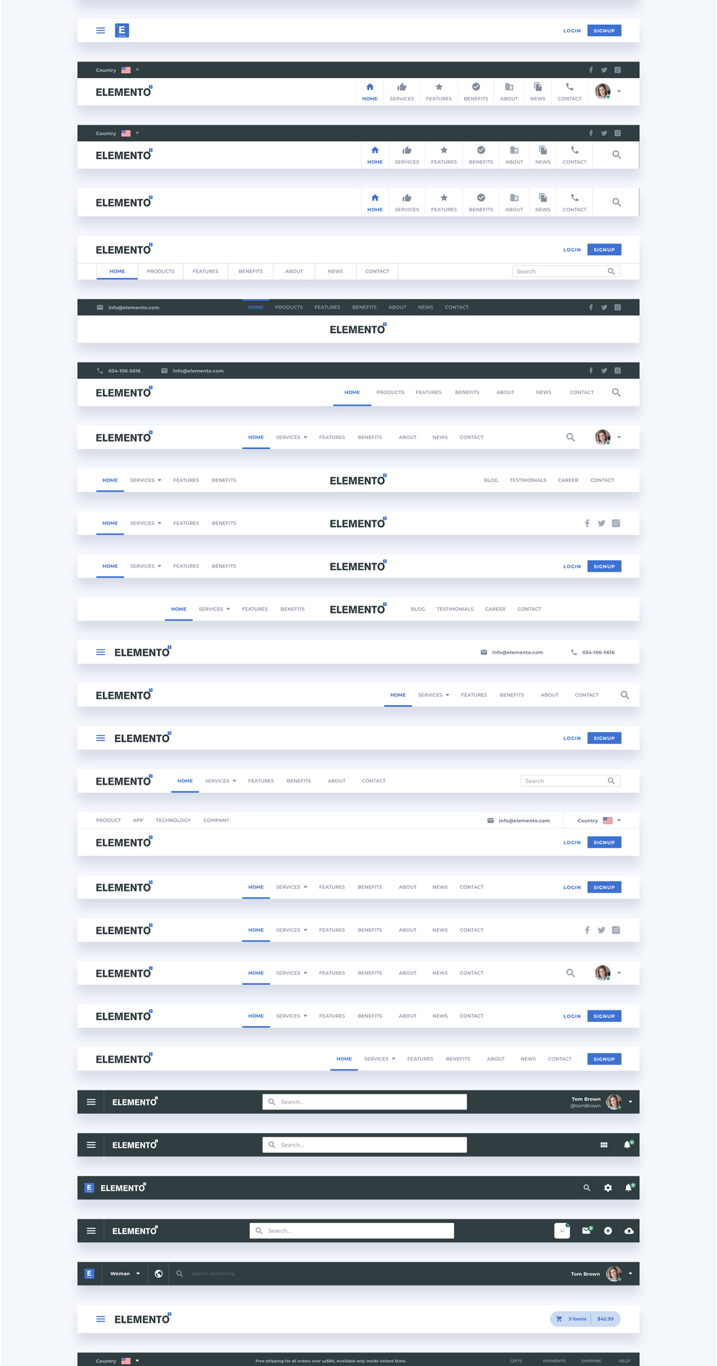
- 40 different navigation styles
- UI kit base elements
- Atomic Design Implementation
- Bootstrap Grid
- Symbols Best Practice
- Text styles
- Google Fonts
- Include library of devices: smartphones, Tablets, laptops, desktop, smart watch, etc.
- Include illustrations
FILE STRUCTURE
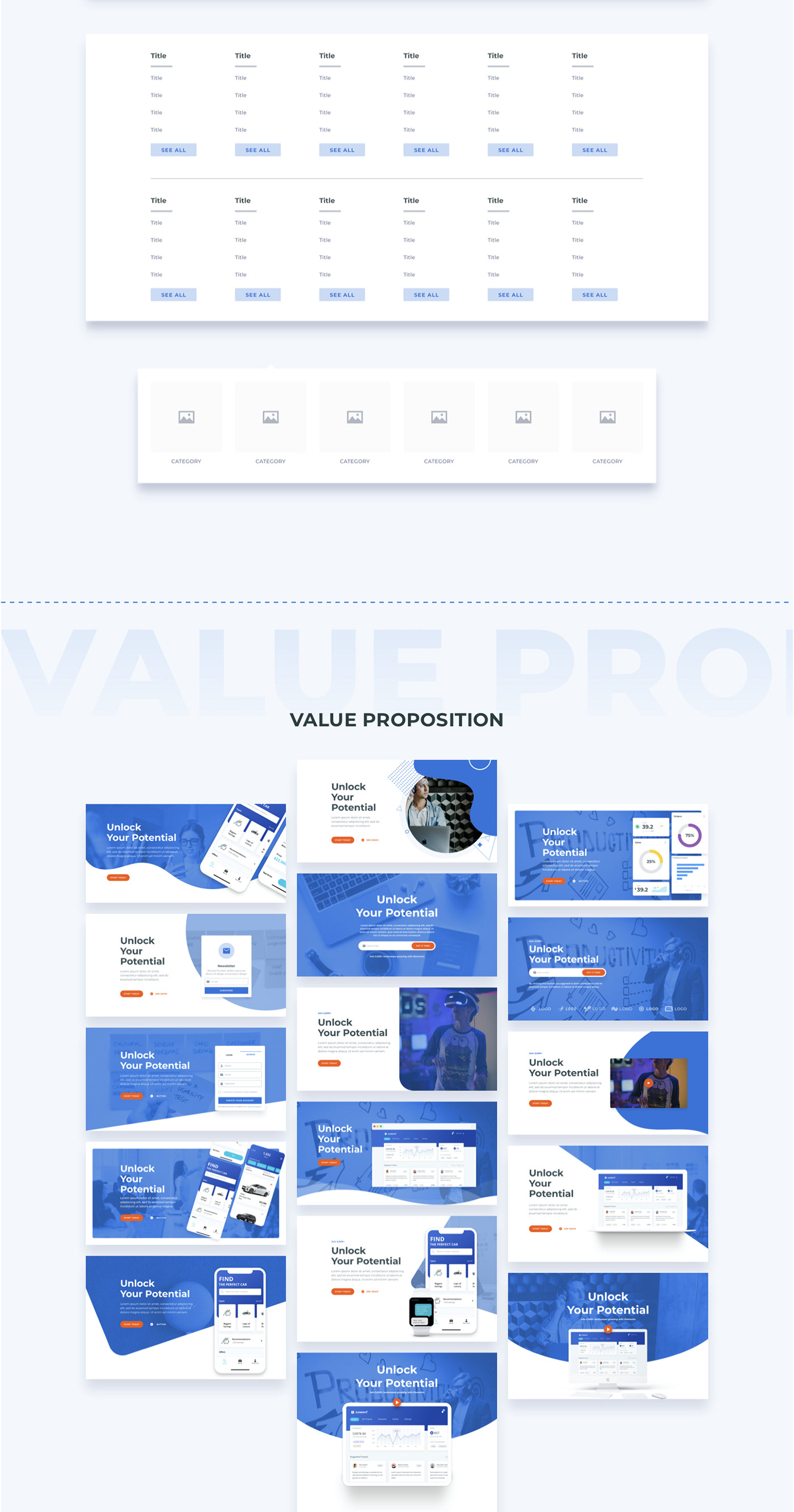
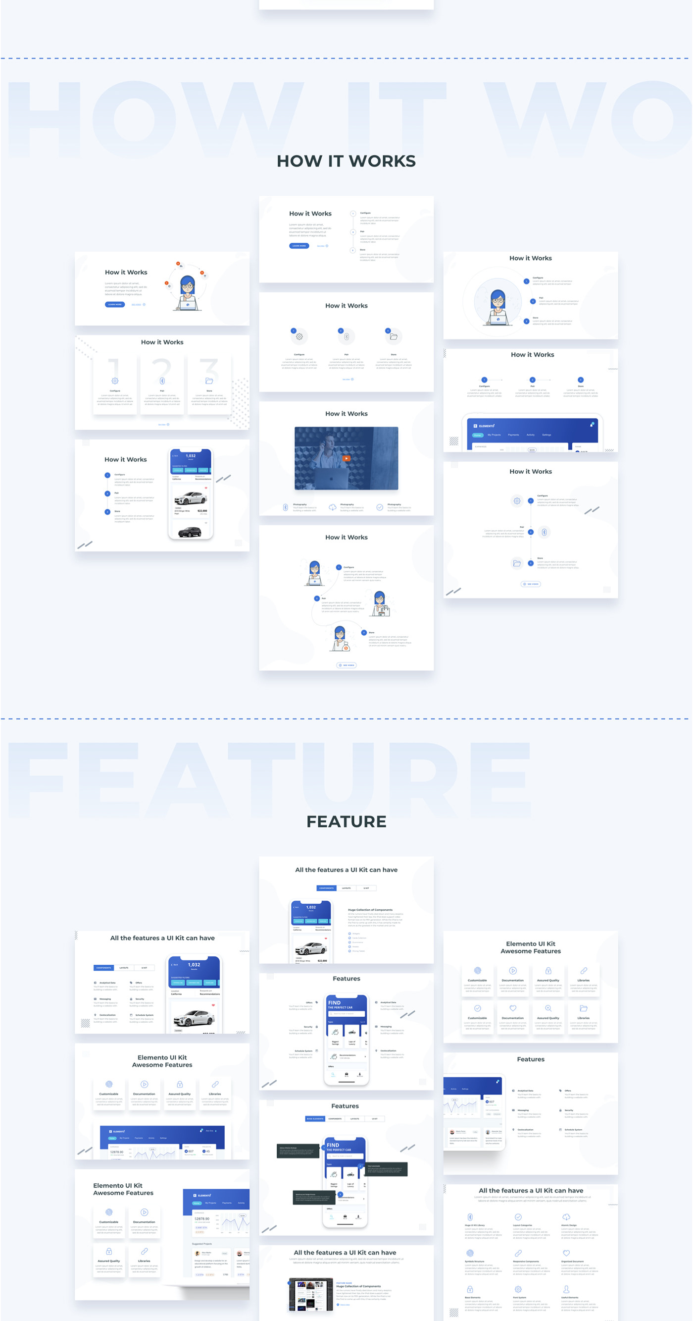
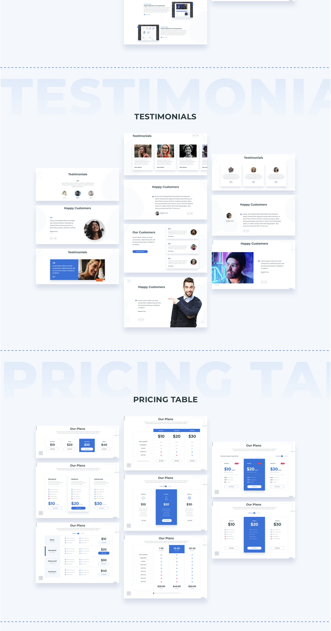
01. LAYOUT CATEGORIES
- Headers
- Value proposition
- How it works
- Features
- Testimonials
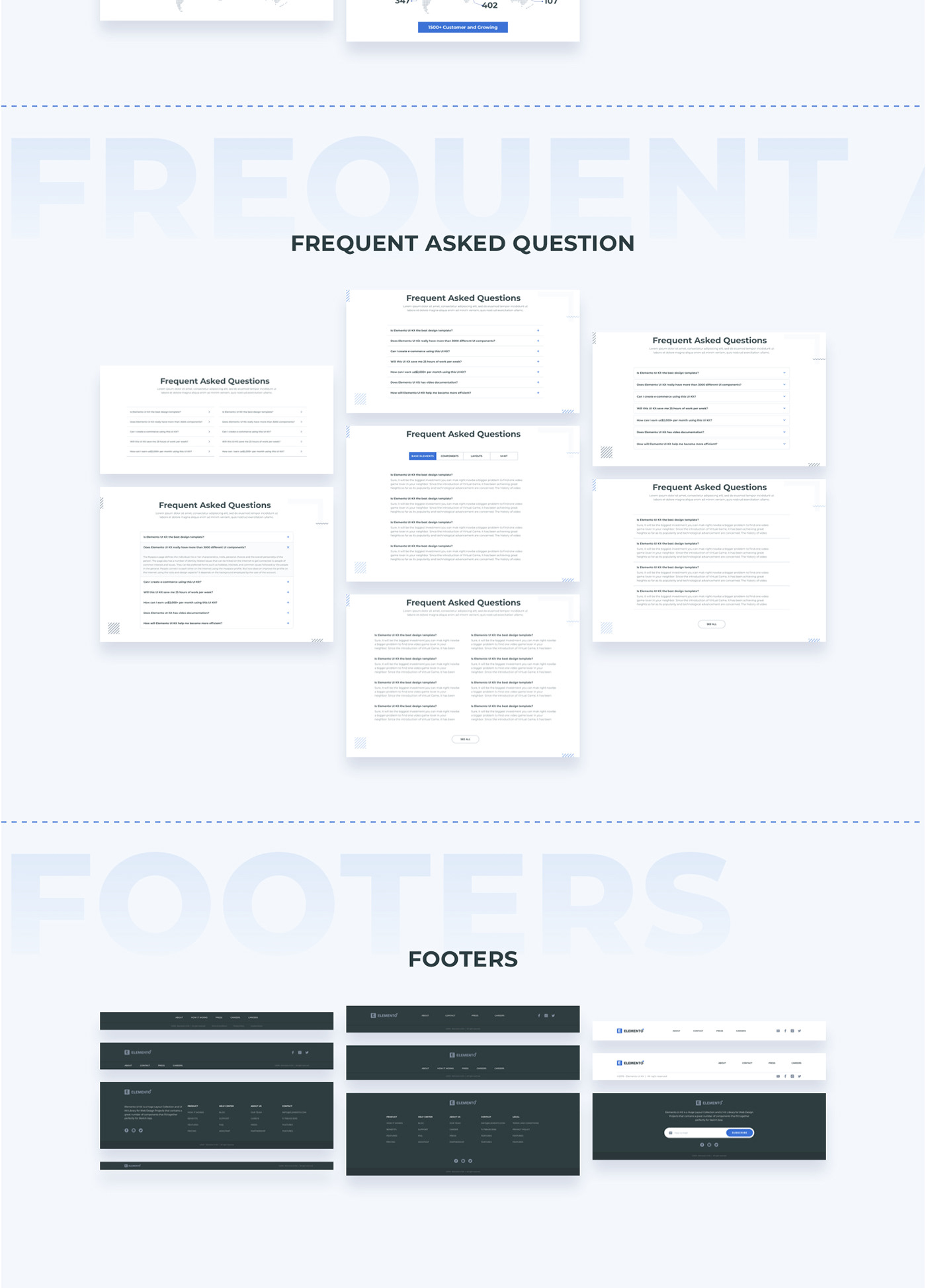
- FAQ – Frequent asked questions
- Pricing table
- Call to actions
- Team
- Metrics
- Footer
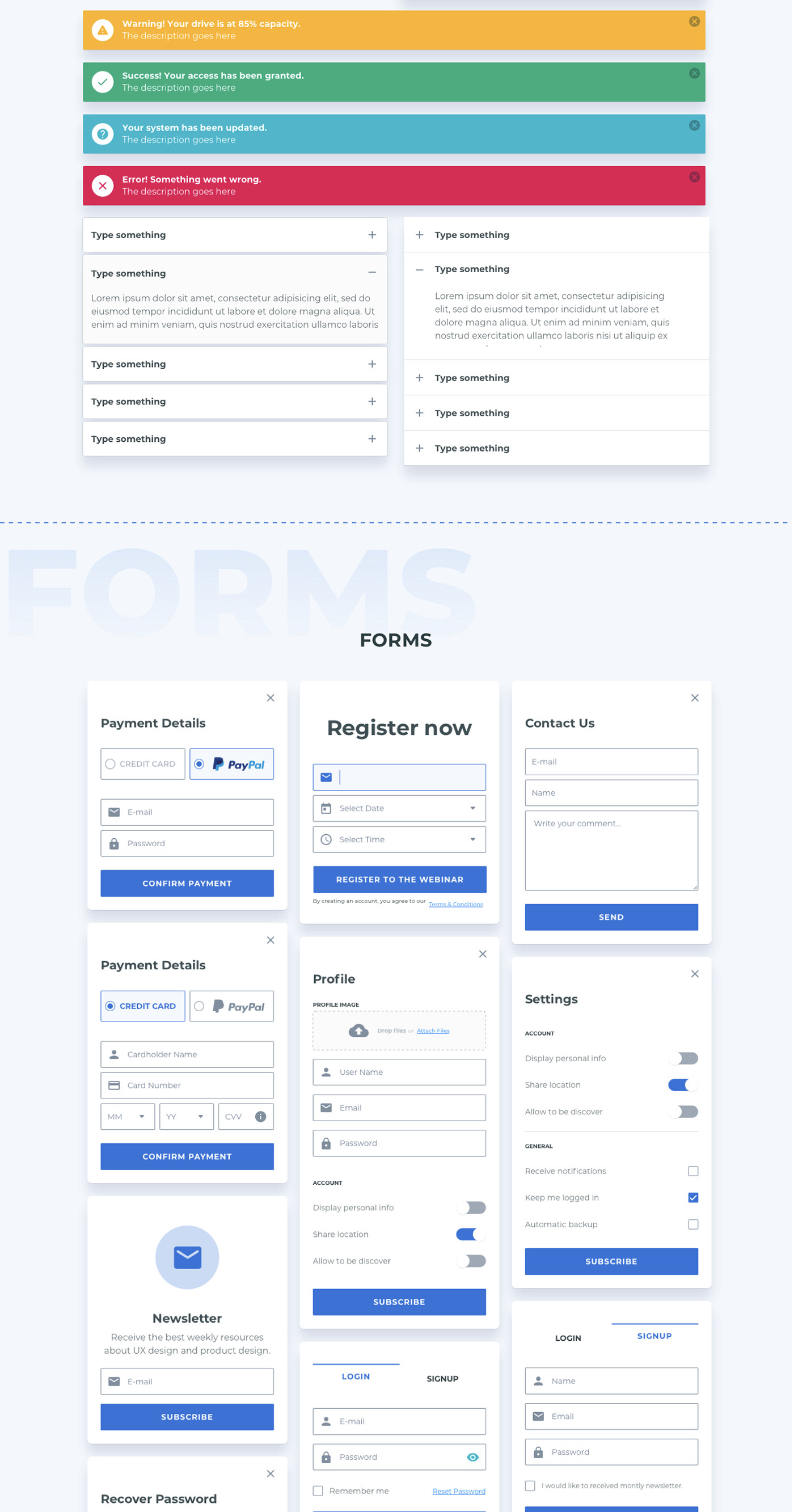
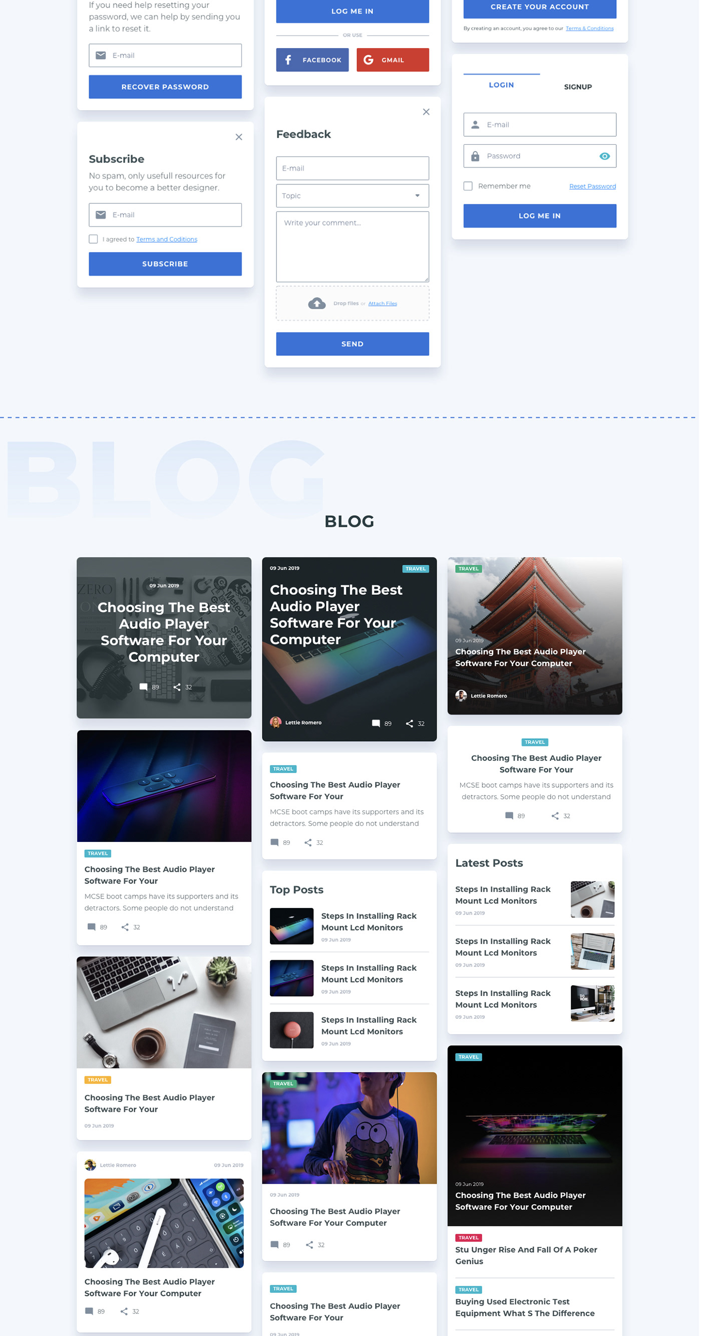
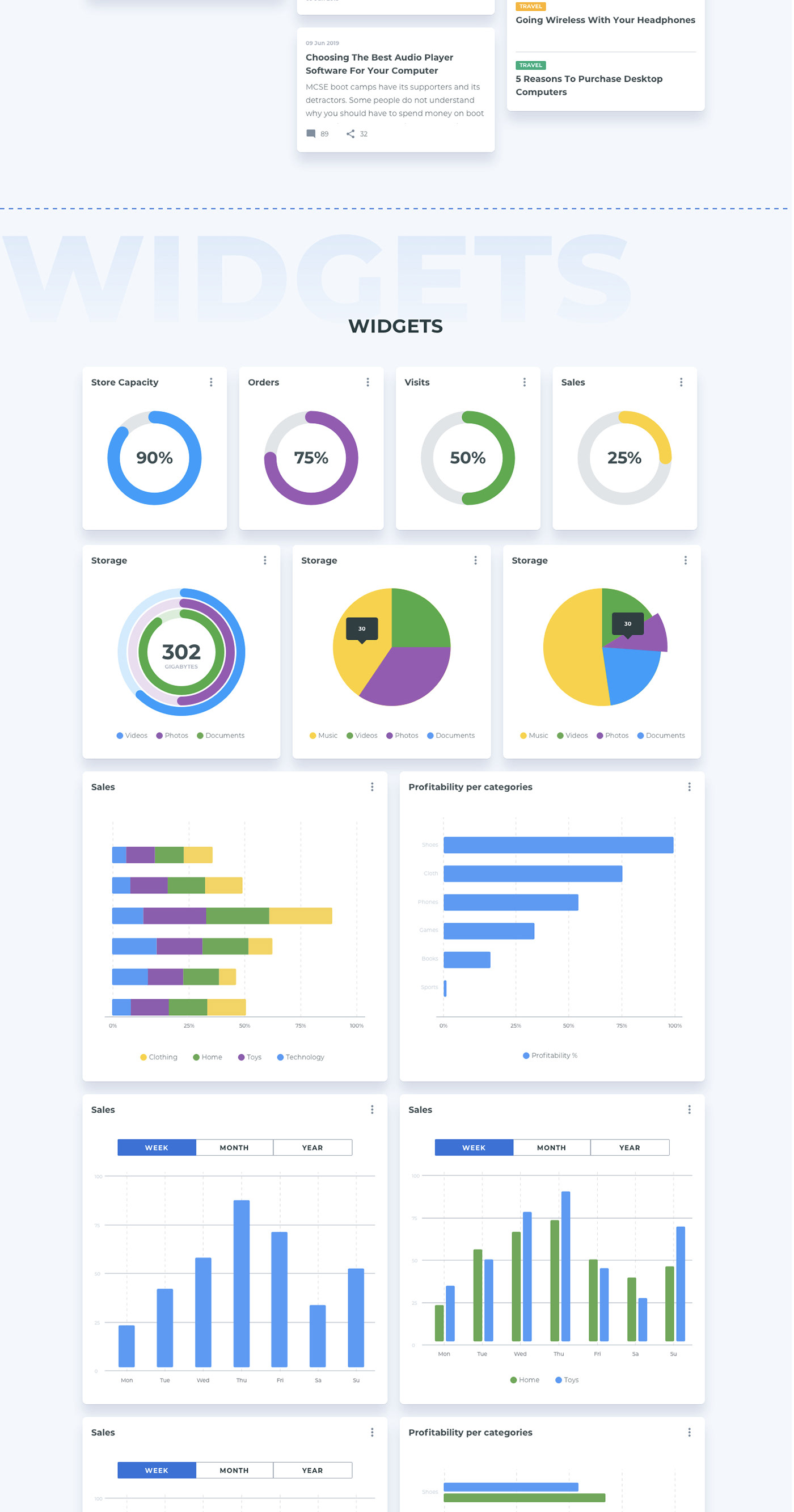
02. COMPONENTS CATEGORIES
- Accordion
- Alerts
- Blog
- Cards
- Dialog
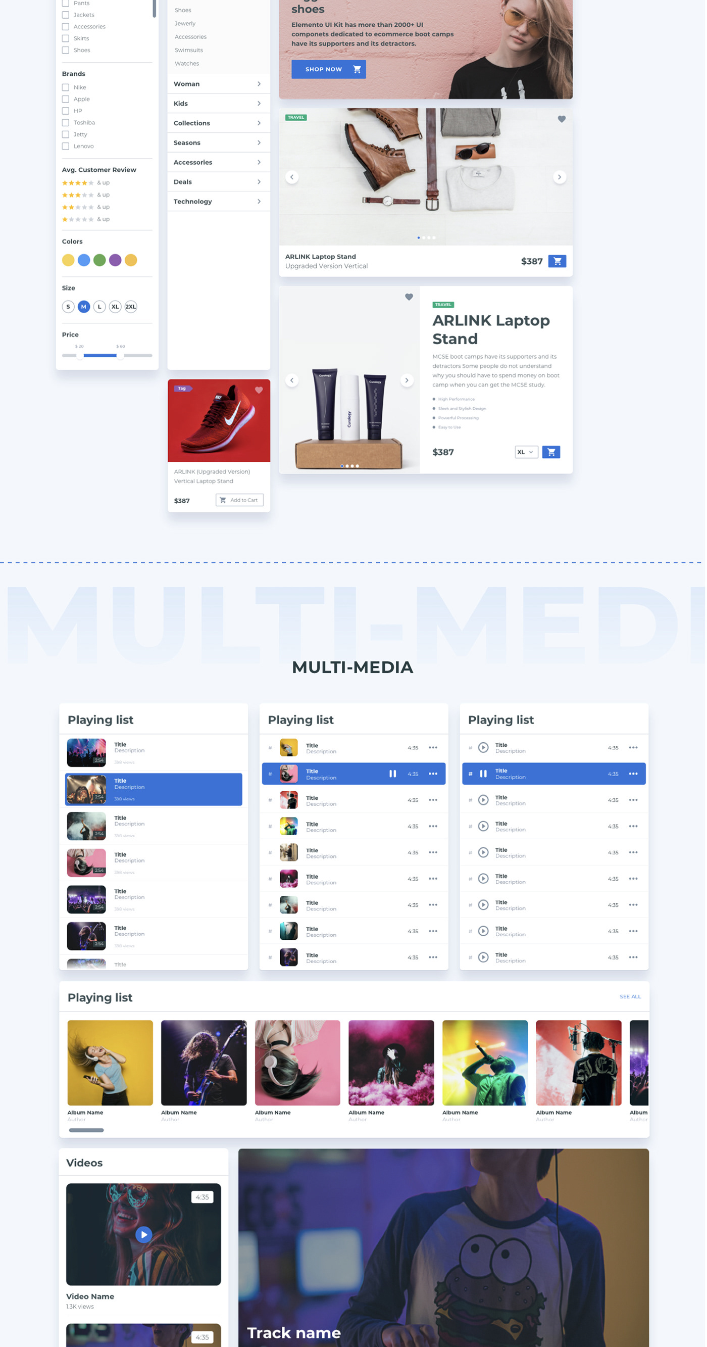
- E-commerce
- Forms
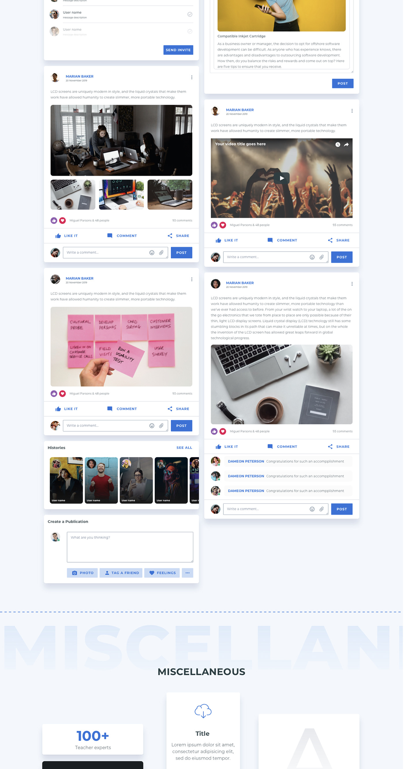
- Miscellaneous
- Modals
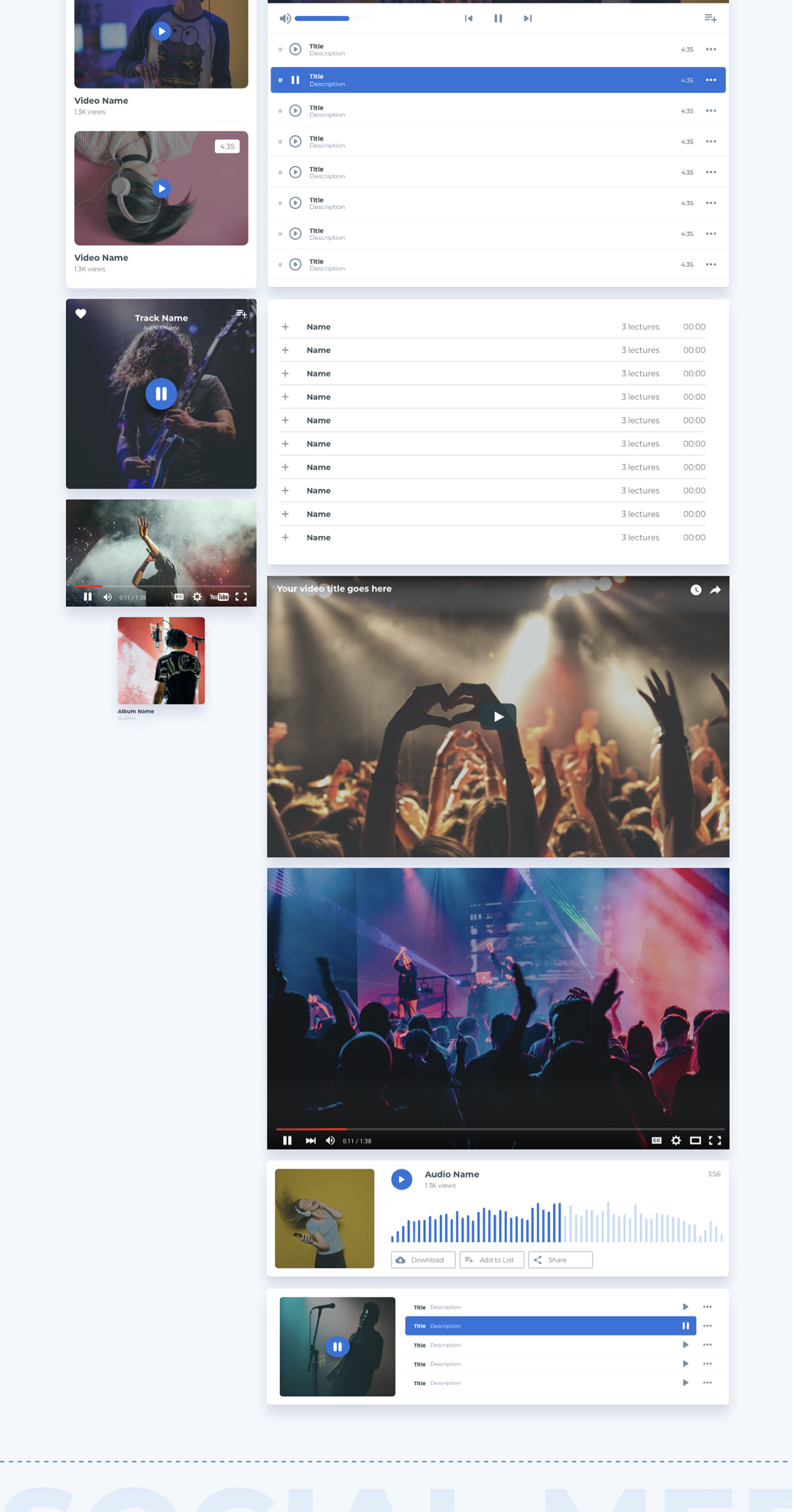
- Multi-Media
- Tab Container
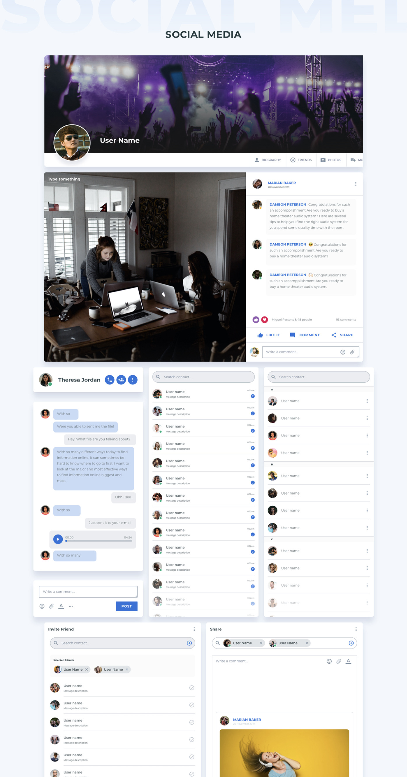
- Social Media
- Widgets
03. UI BASE ELEMENTS
- Avatar
- Breadcrumb
- Badge
- Buttons
- Checkbox
- Cursors
- Devices Mockups
- Dropdown
- Forms
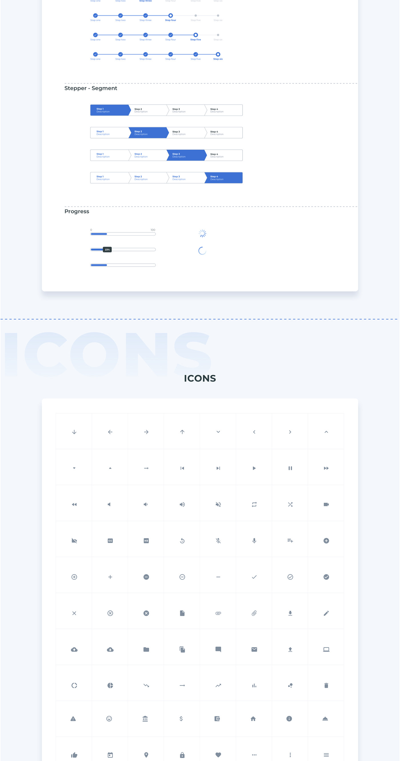
- Icons
- Illustrations
- Images
- Inputs
- Loading
- Media: Video players and Images
- Pagination
- Pager
- Panel
- Pills
- Popover
- Pricing Tables
- Progress Bar
- Rating
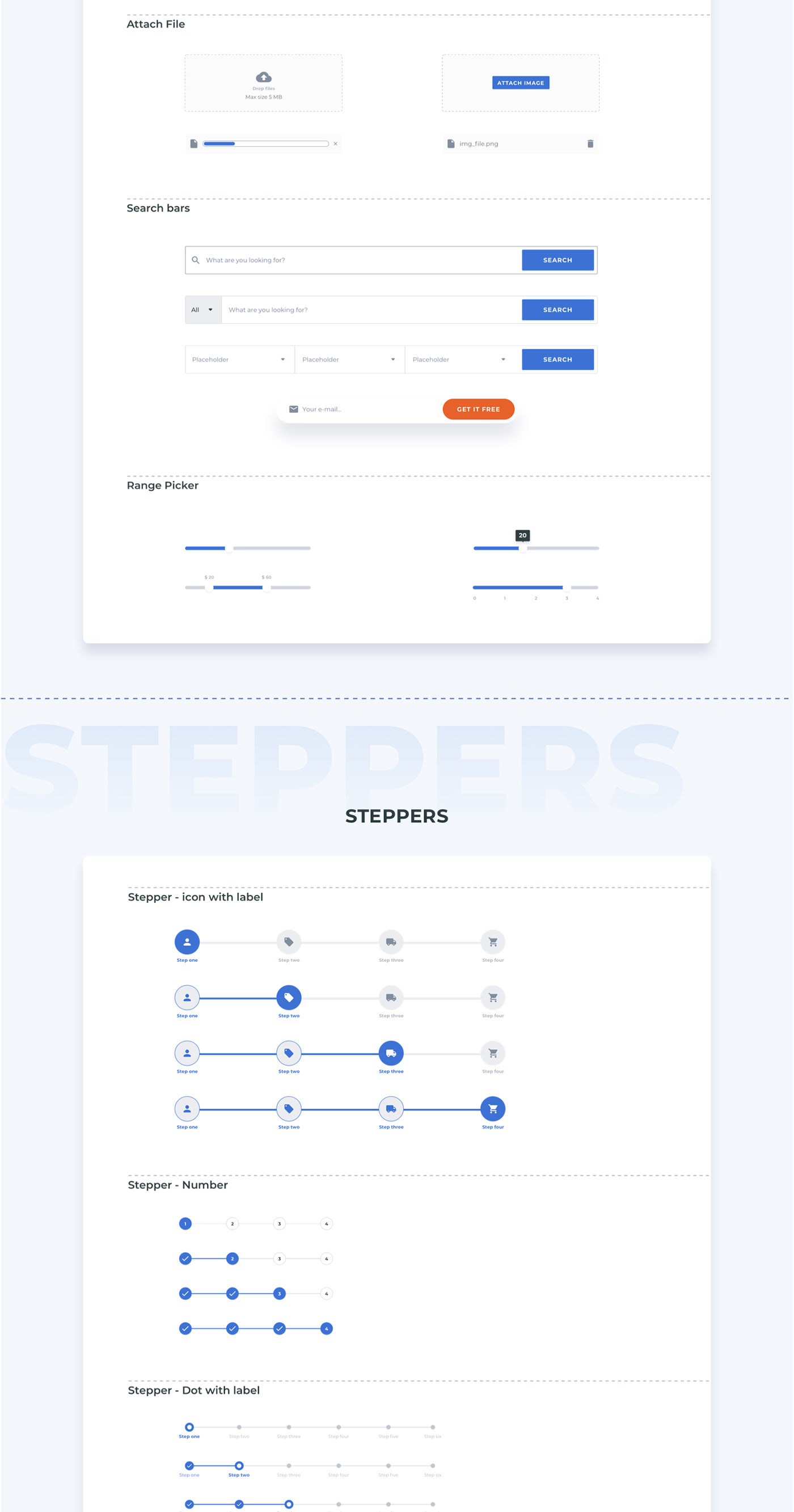
- Range Picker
- Radio Button
- Steppers
- Group Button
- Switch
- Social. Media Button
- Tabs
- Tag
- Text Area
- Text fields
- Tooltips
- Upload File
- Etc…
04. LANDING PAGE
- Application Landing Page
- Saas Landing Page
05. STYLE GUIDE
- Logo
- Colors & Shapes
- Font: Headers
- Font Paragraph
- Font: Buttons & Links
SOURCE & CREDITS
FONT USED
You need to install the font on the following link before start editing the Sketch files (you can find it at Google Fonts website) Montserrat
IMAGES
All images are just used for Preview Purpose Only. They are not part of the template and are NOT included in the final purchase files. All images where found at https://unsplash.com/
Recent Comments